Installations
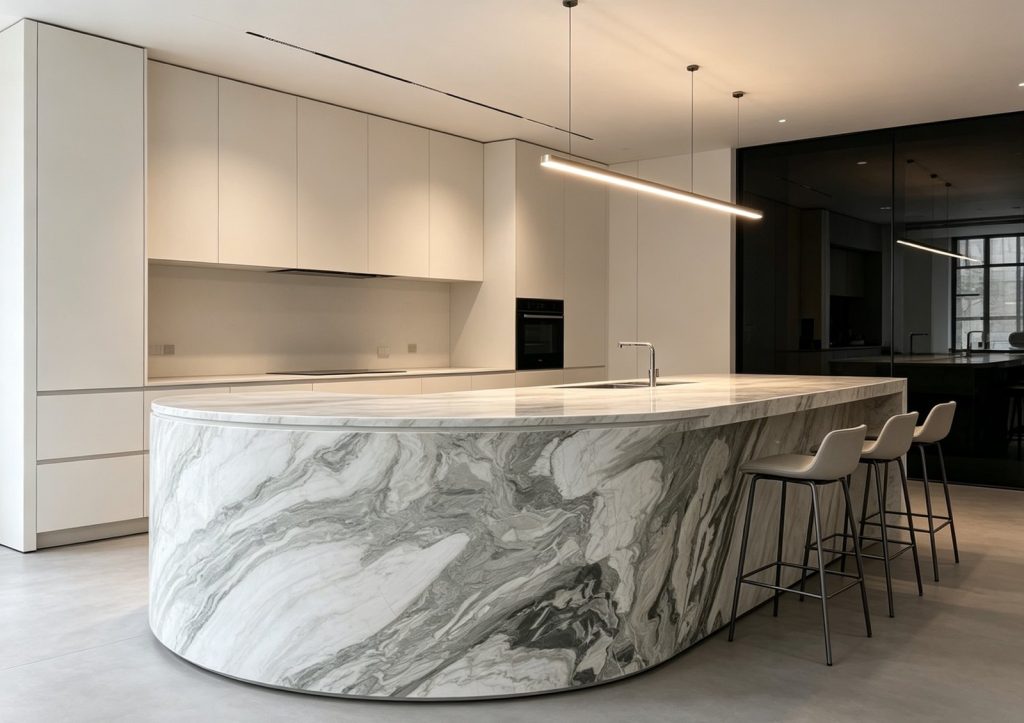
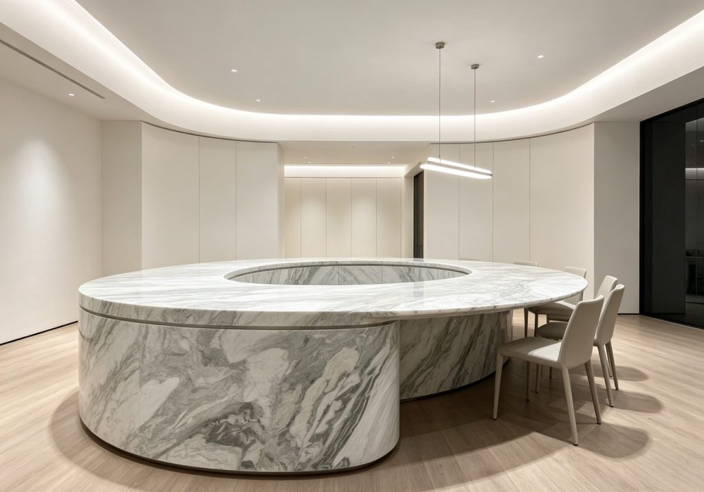
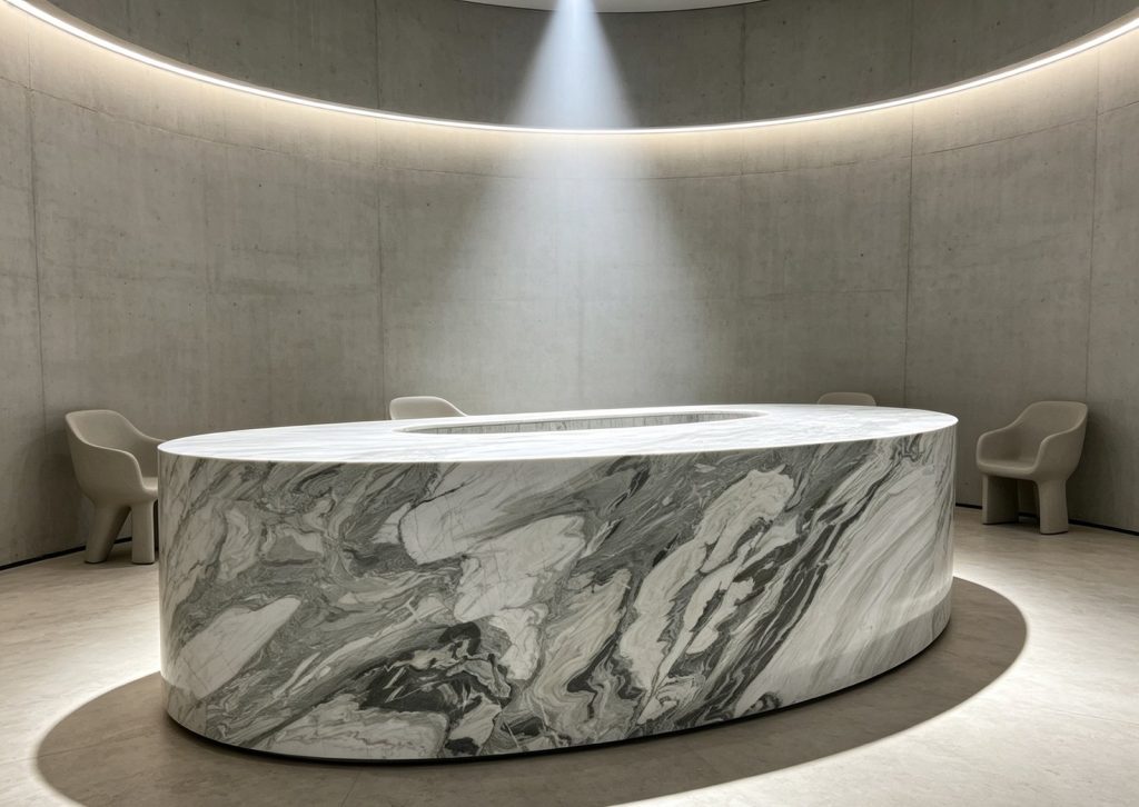
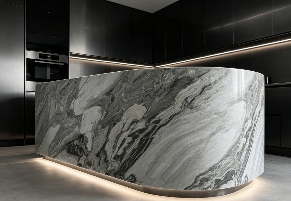
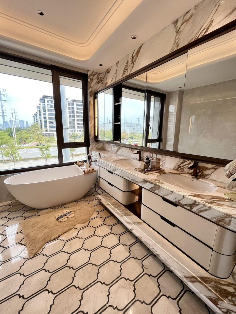
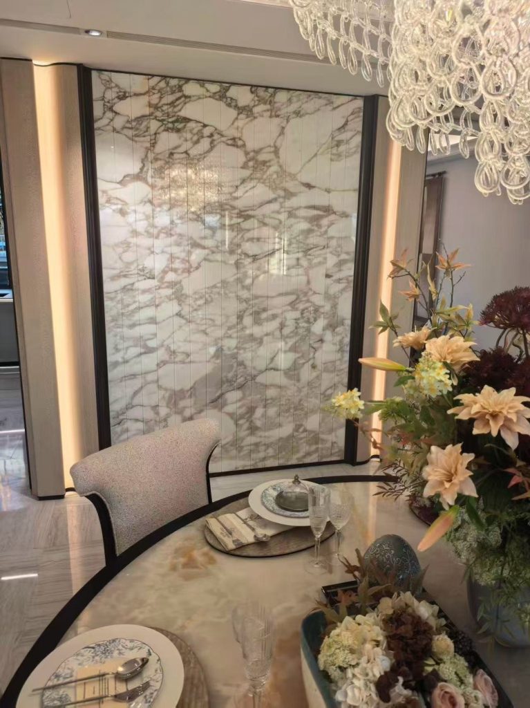
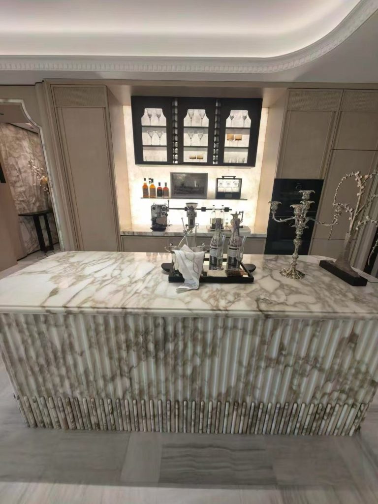
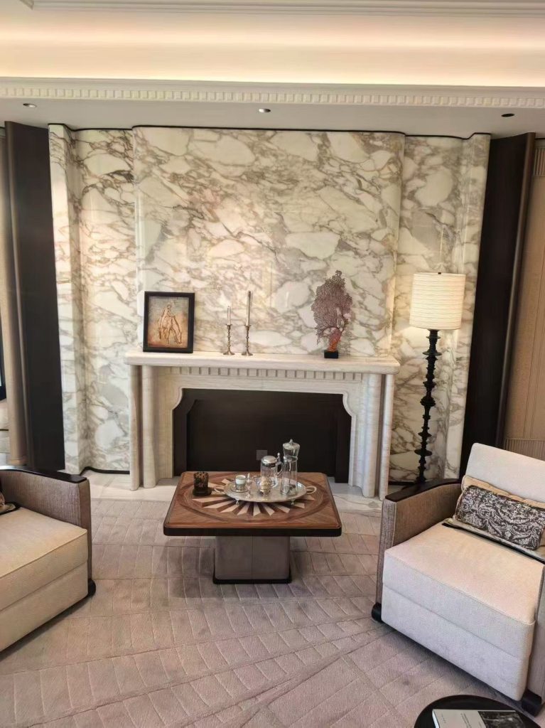
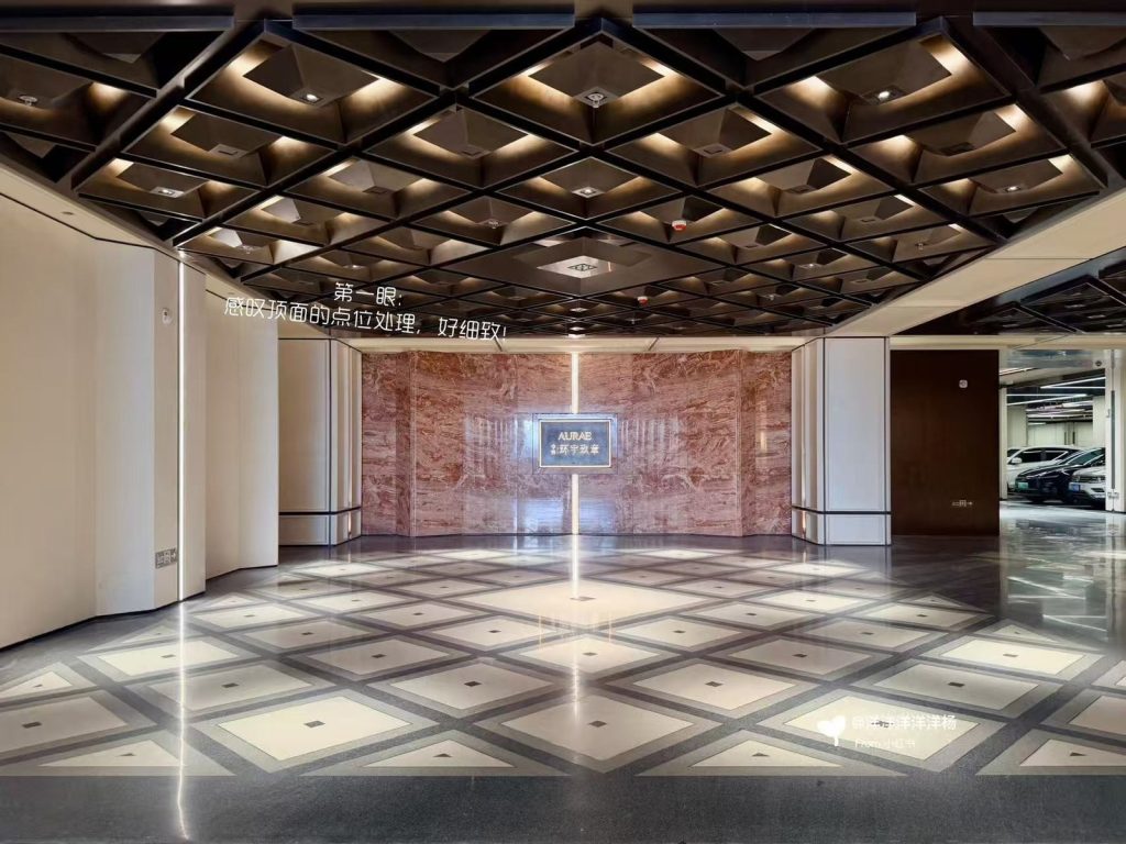
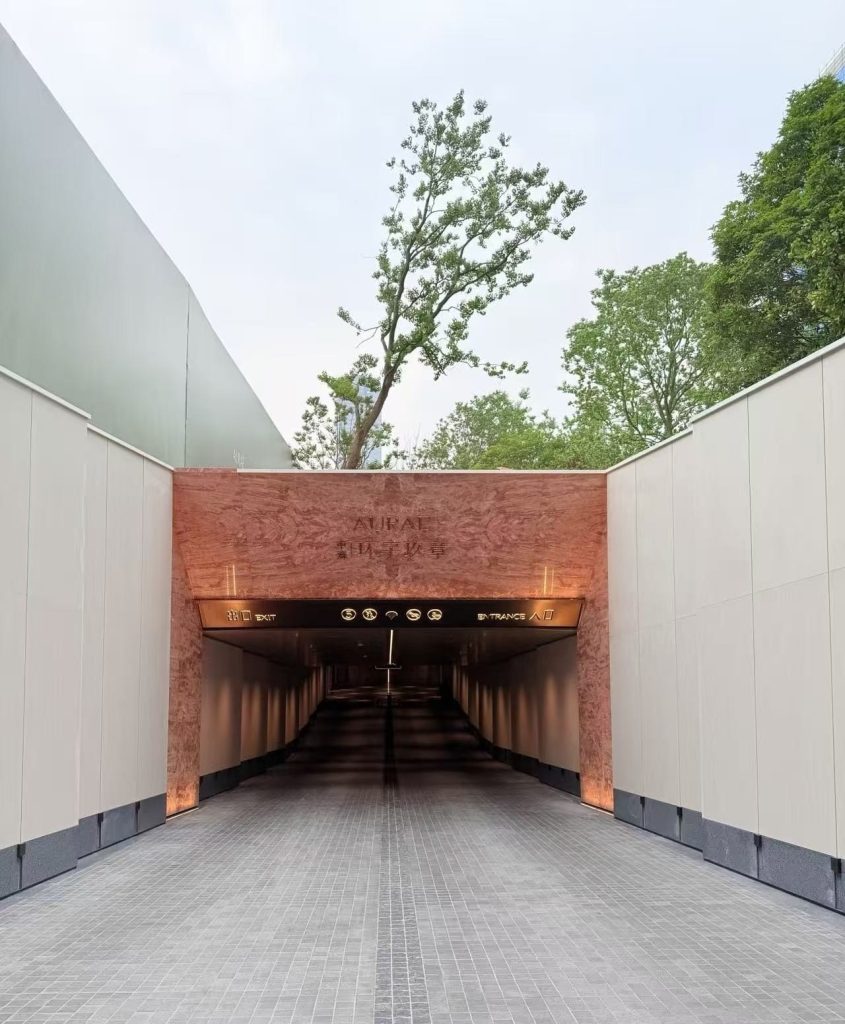
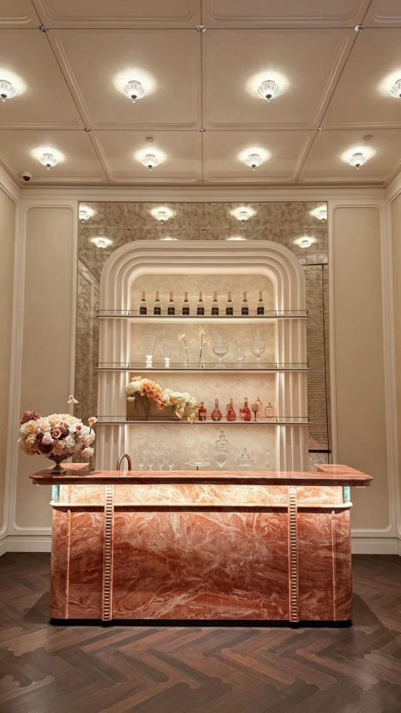
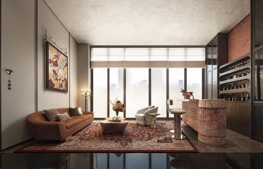
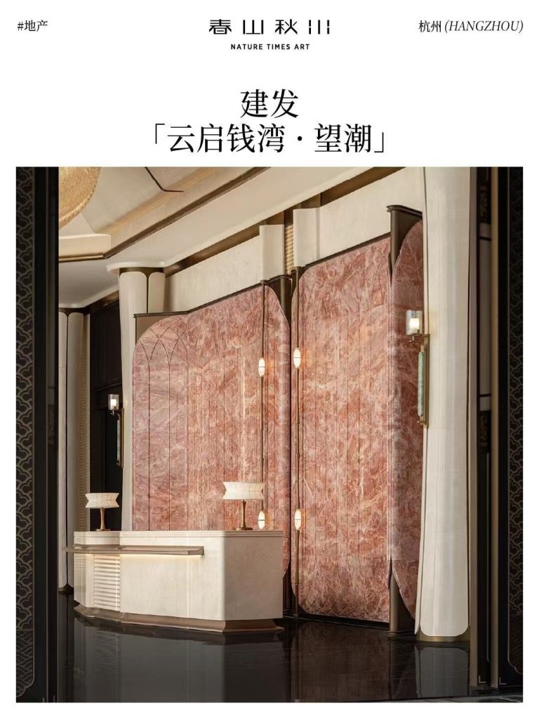
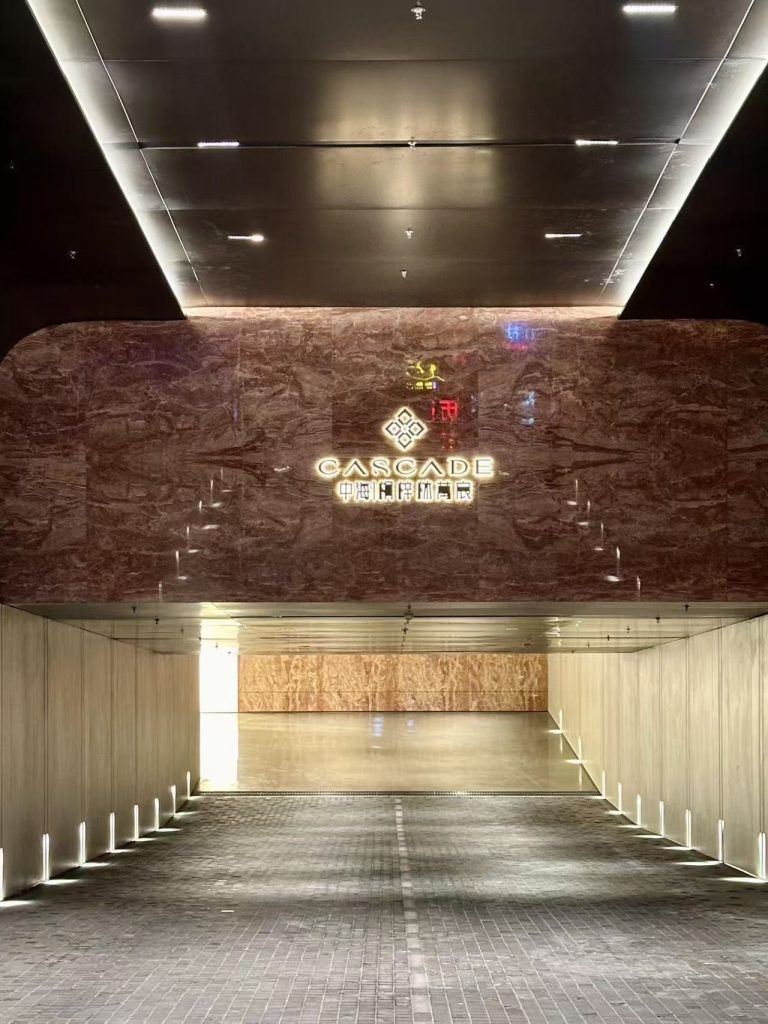
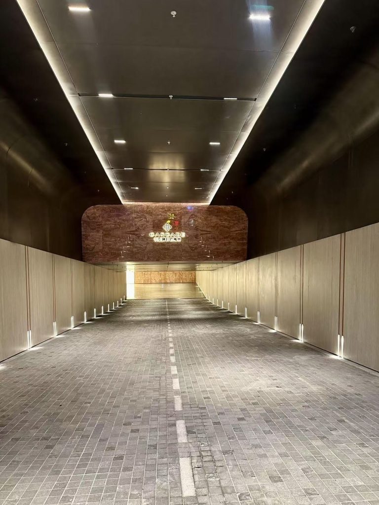
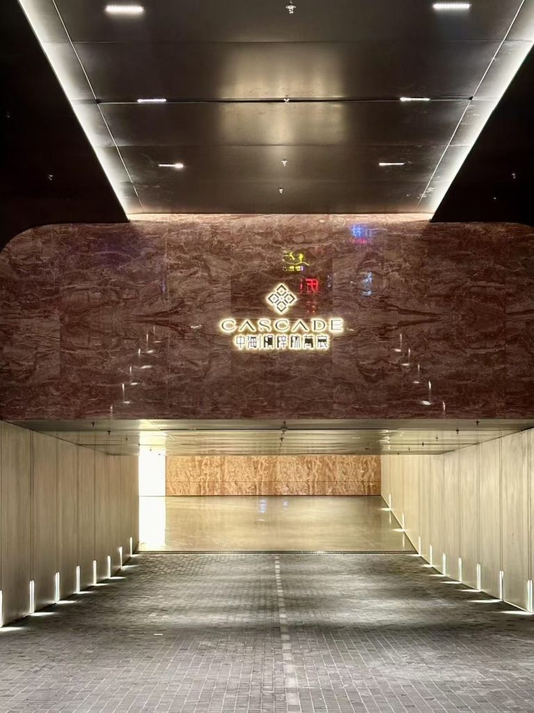
Real stone, on the wall and in the room — a reference set across four marbles, from curved reception walls to book-matched islands.
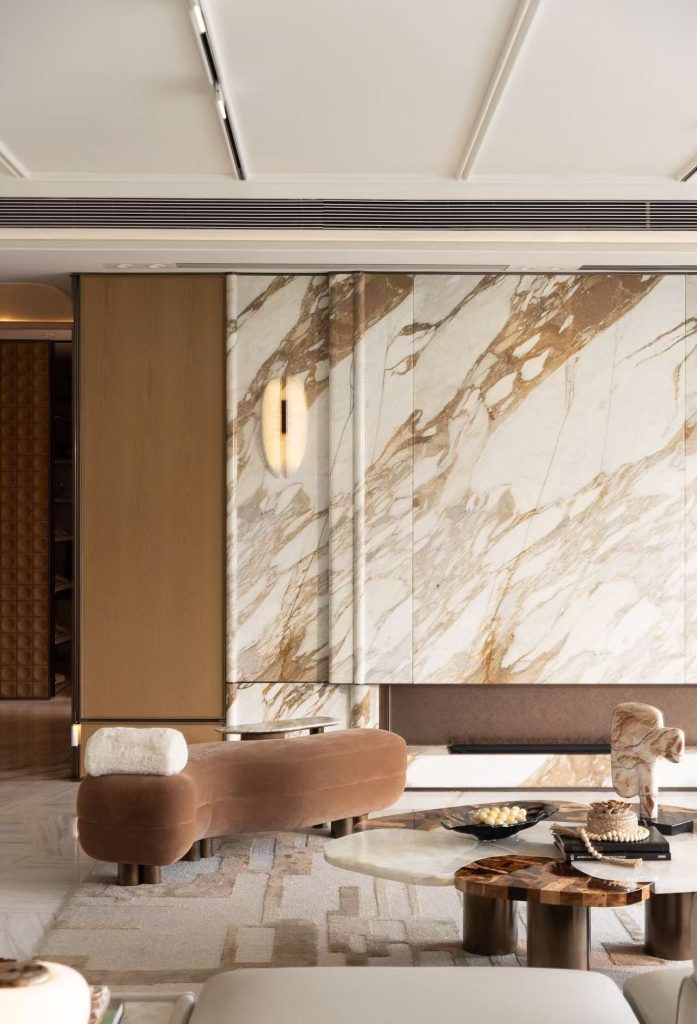
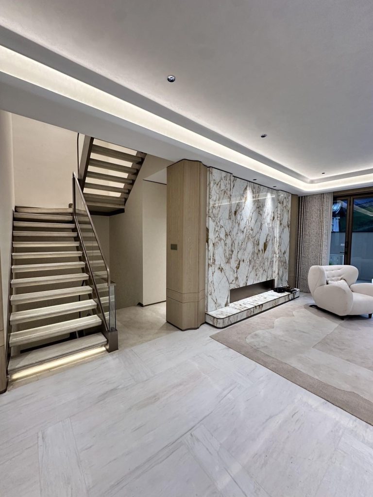
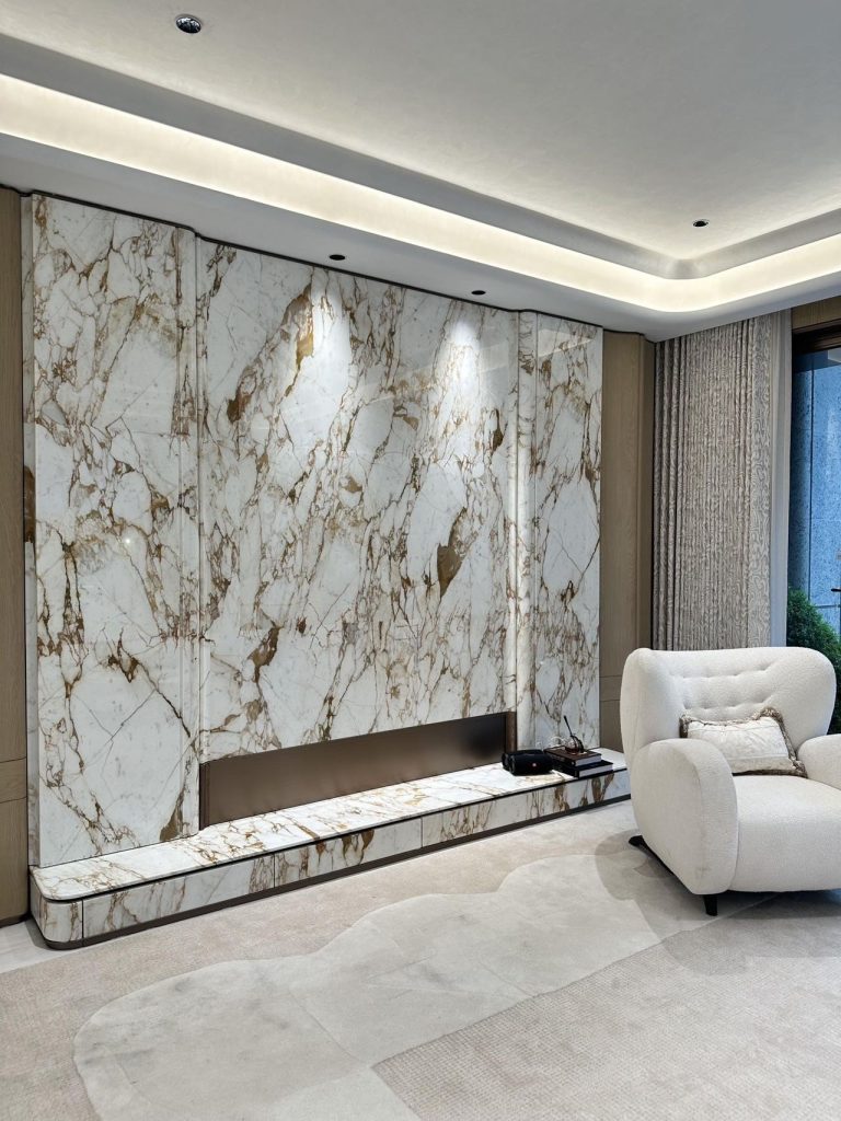
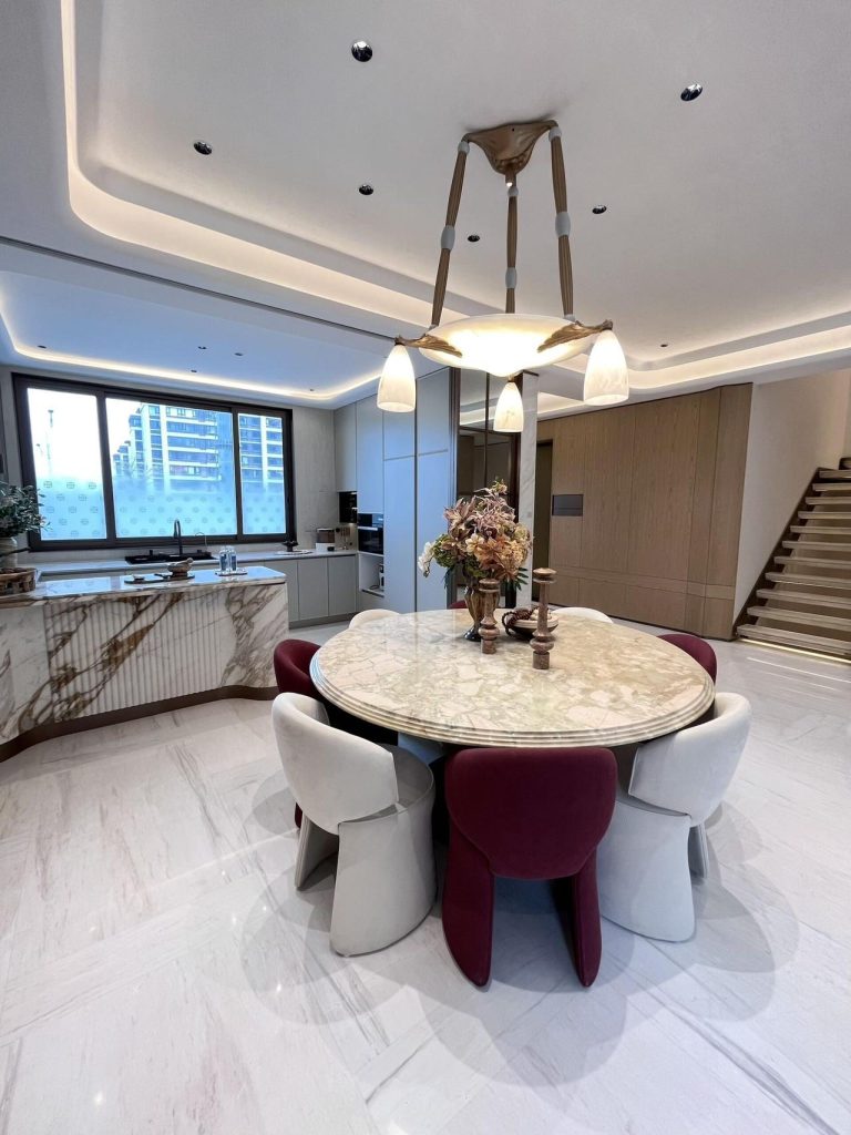
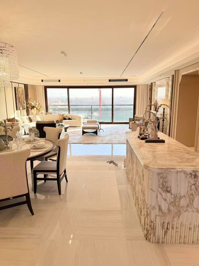
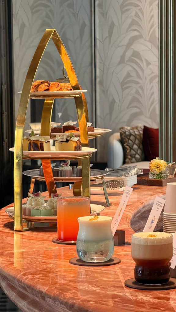
A finish sample tells you the colour and the grain. It does not tell you what happens when the block is opened up, book-matched and lit from below. These are the stones we cut, set and finished — photographed on site, without filters, so you can see how the movement reads across a large face.
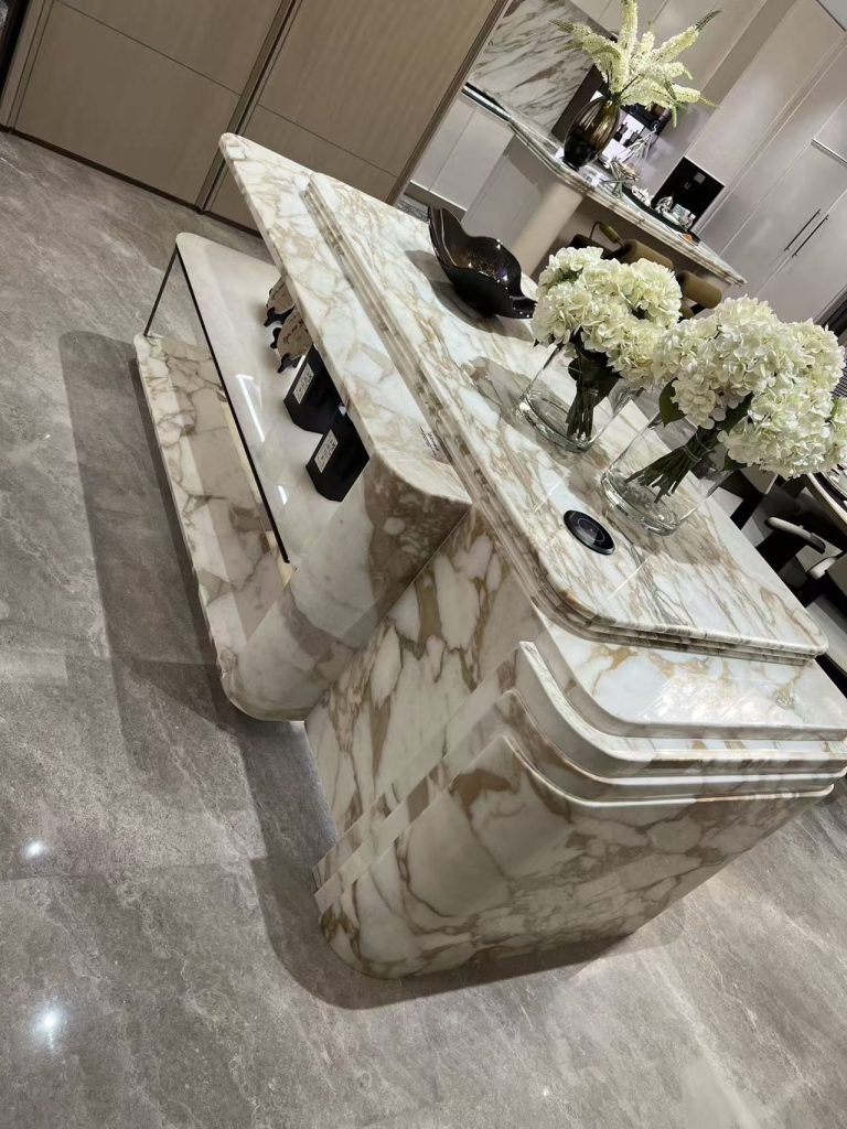
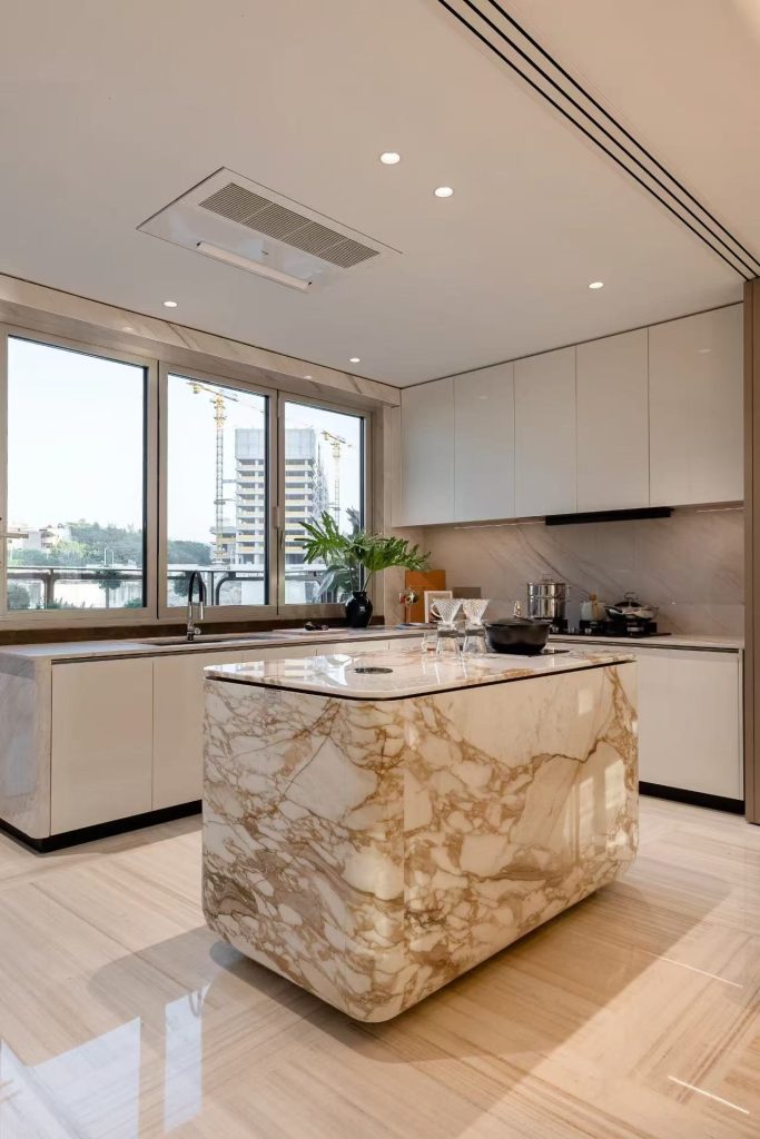
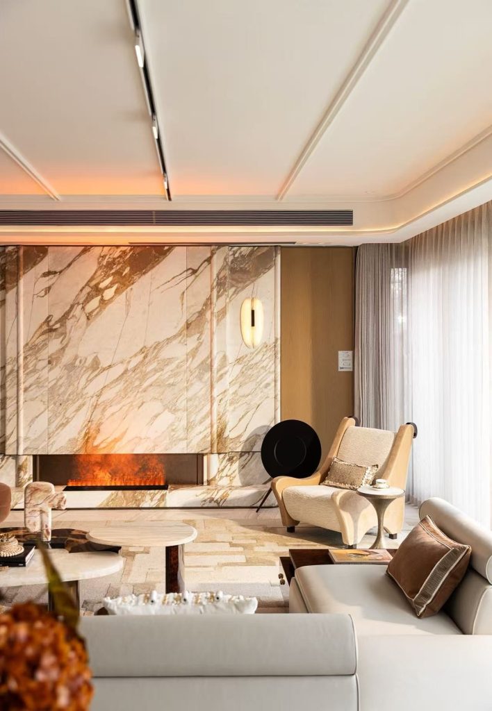
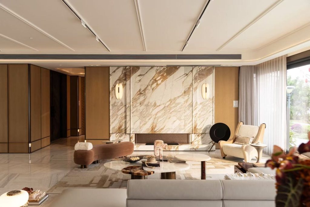
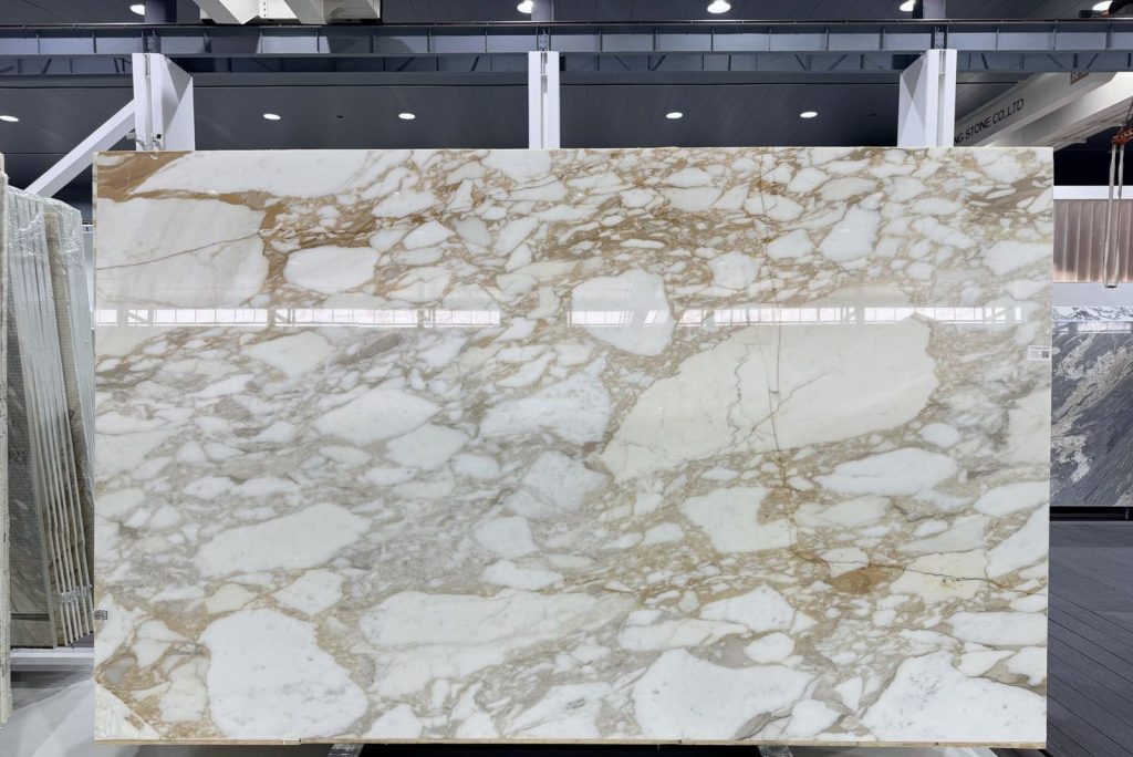
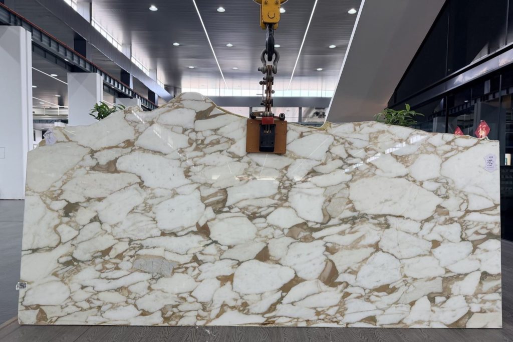
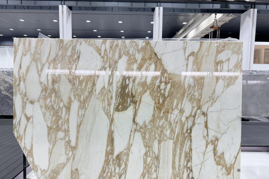
Warm white marble with heavy gold veining — book-matched islands, feature walls and back bars.
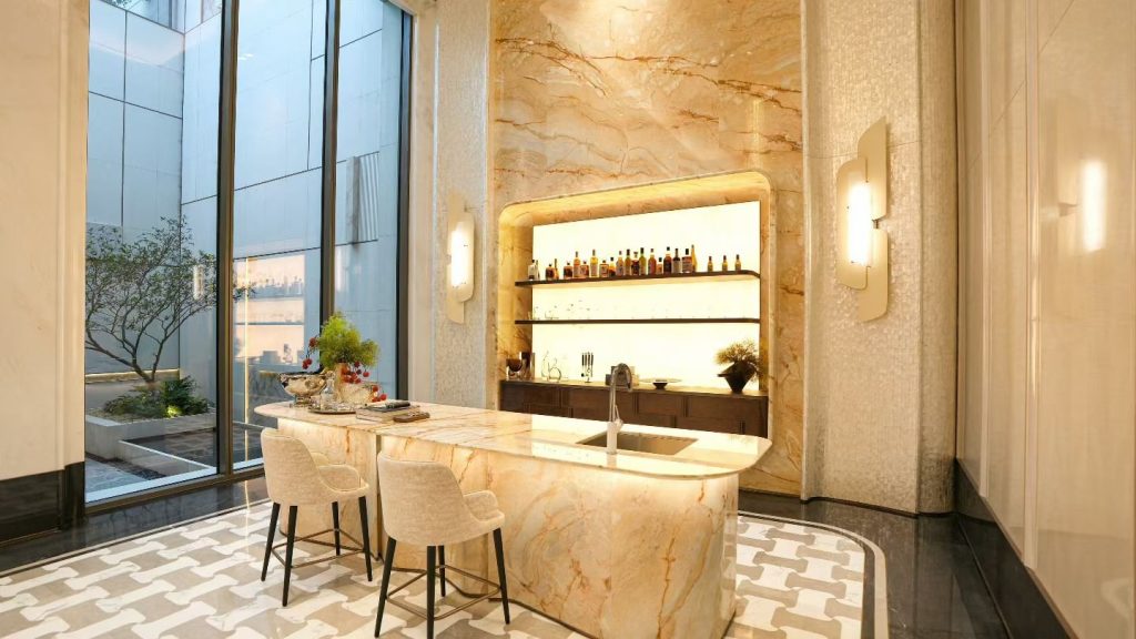
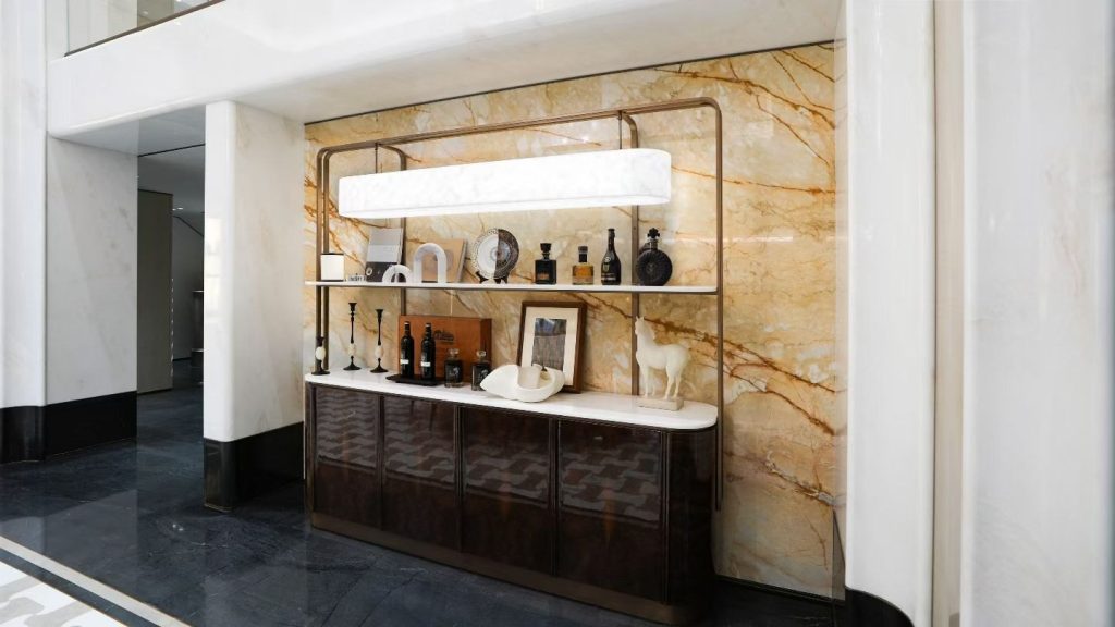
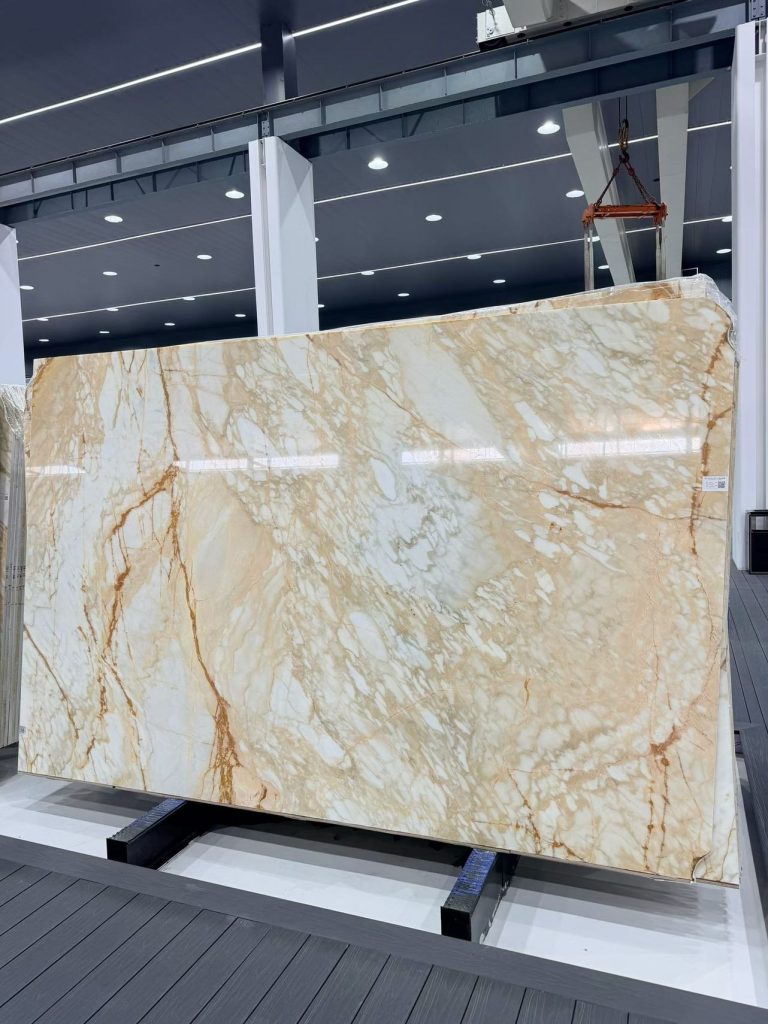
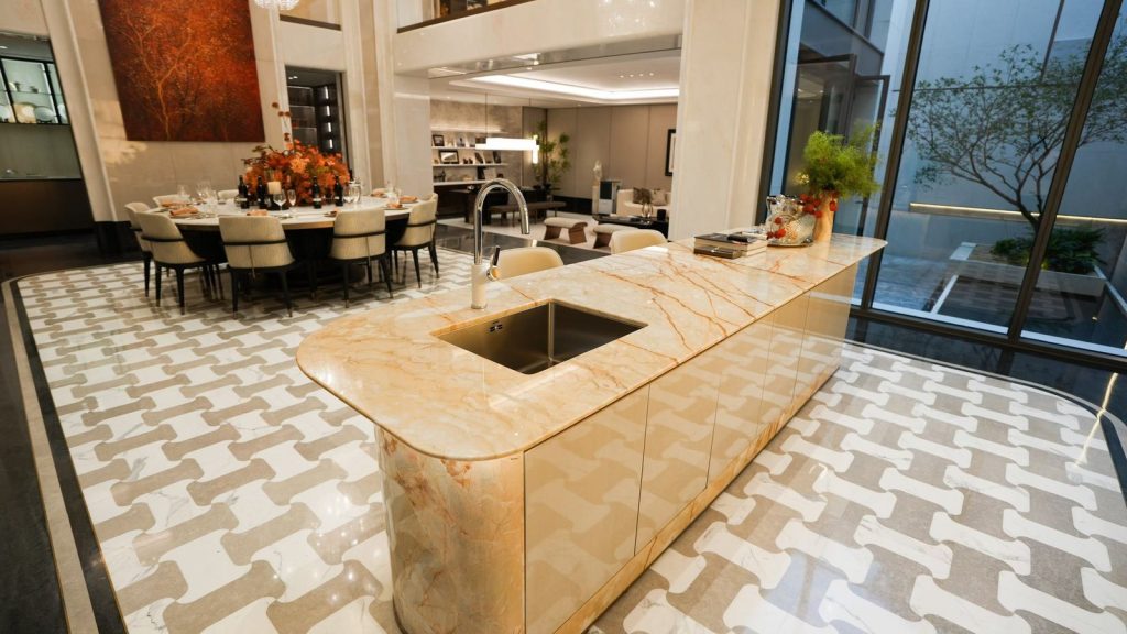
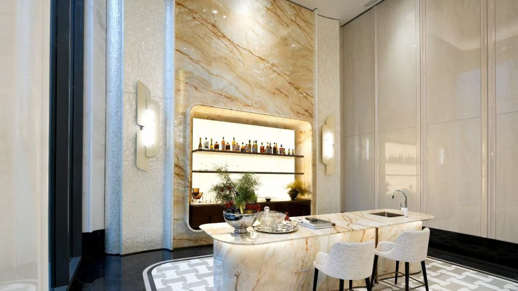
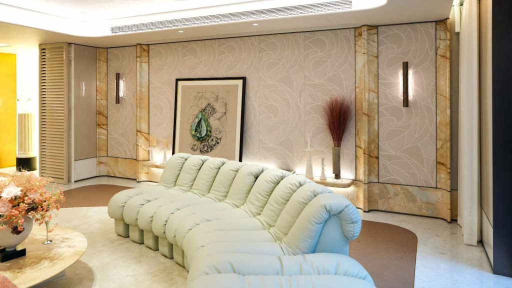
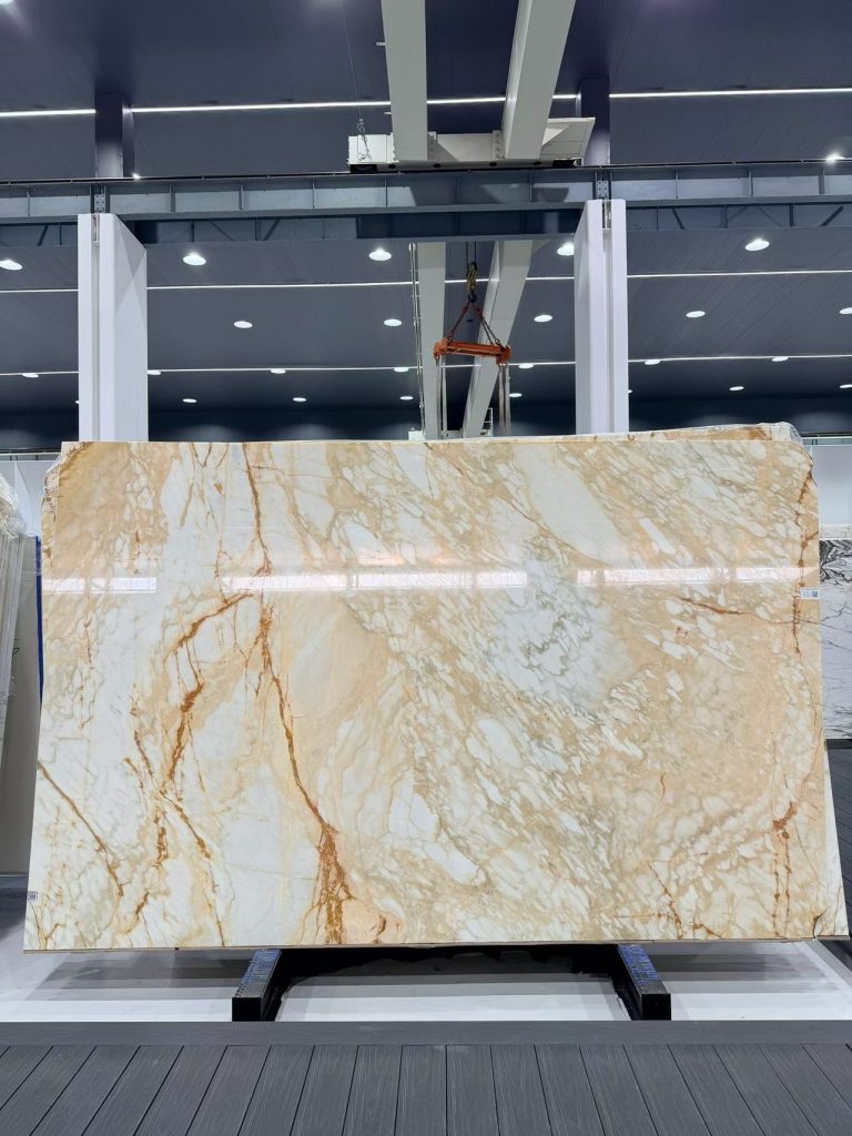
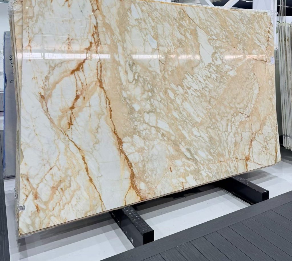
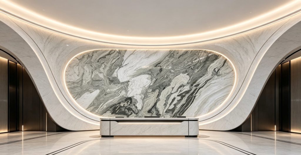
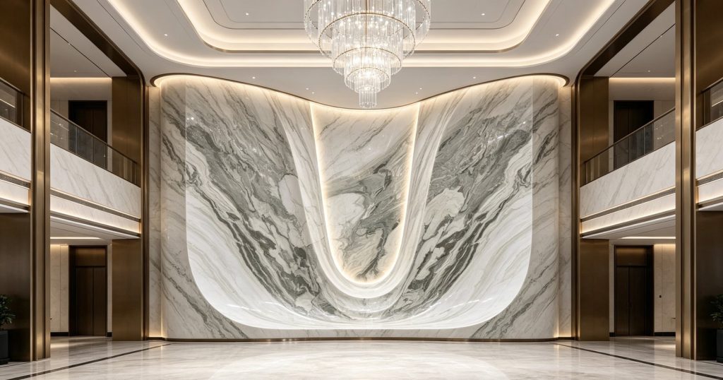
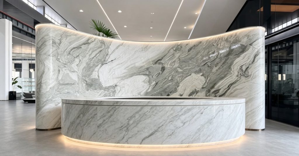
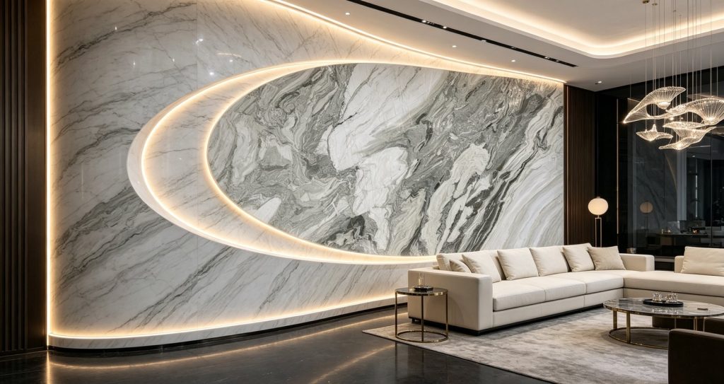
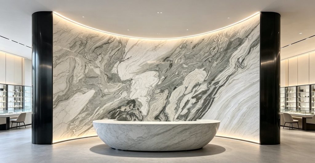
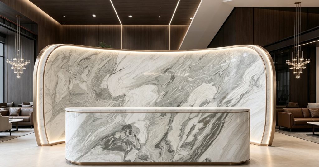
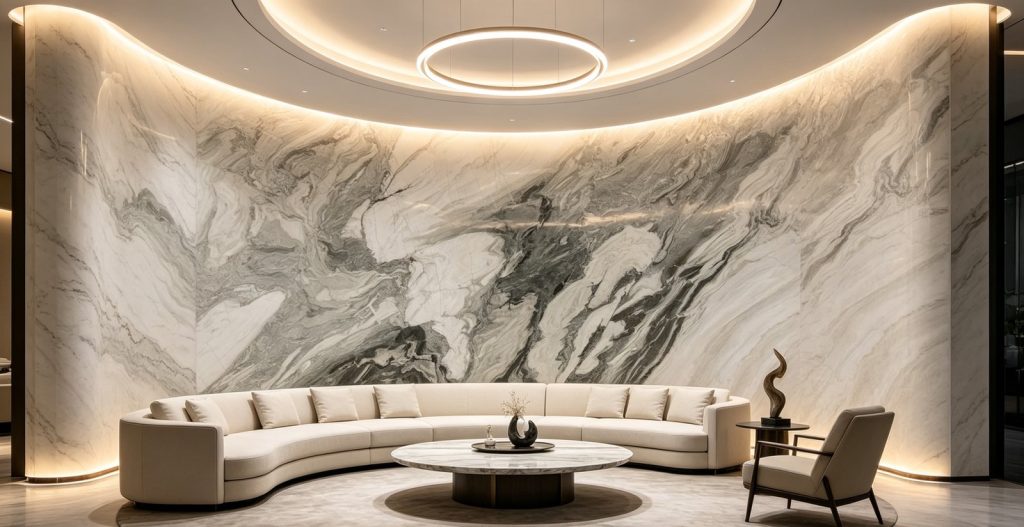
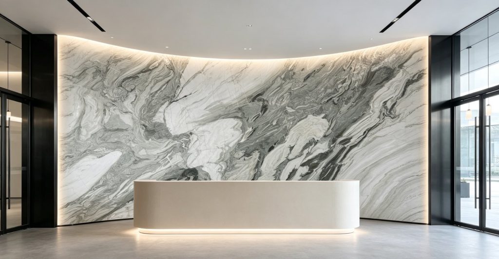
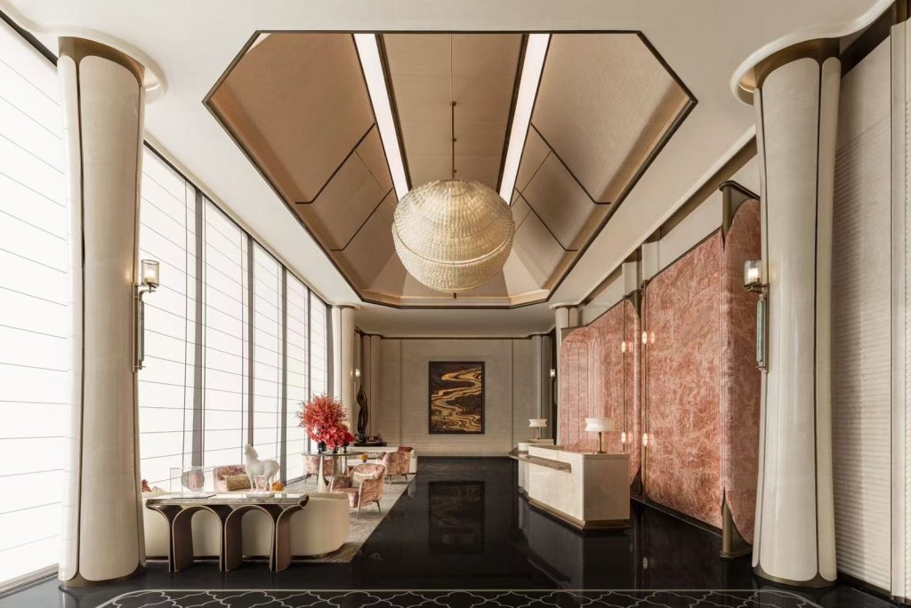
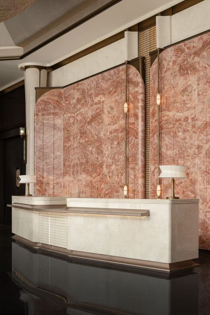
A soft grey-and-white marble cut into curves: reception desks, atrium walls and bar fronts.
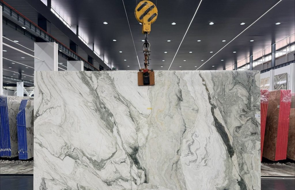
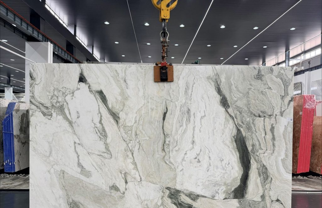
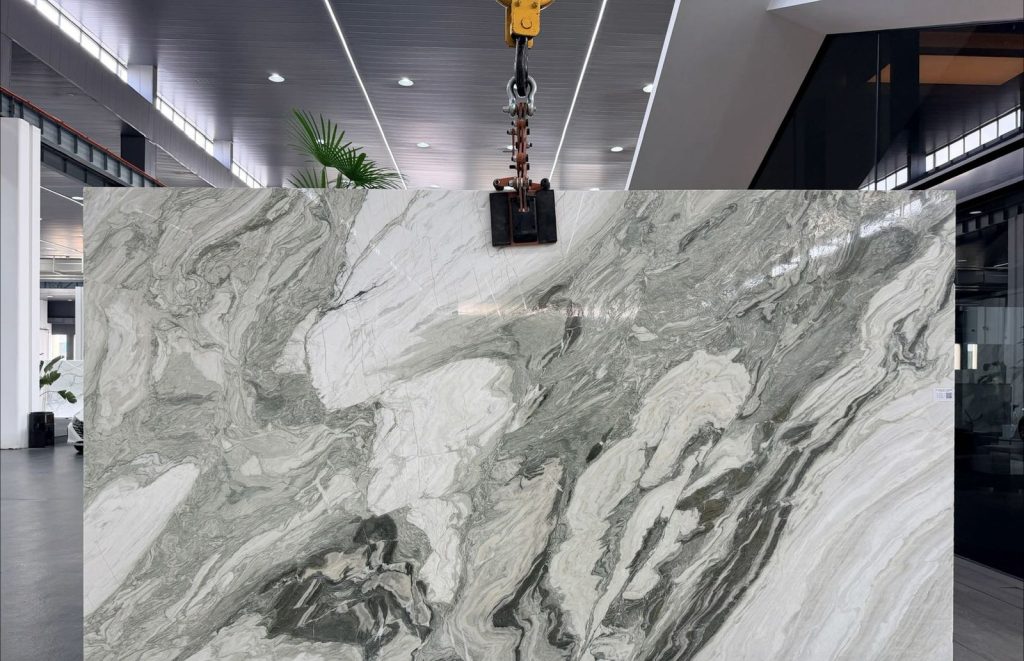
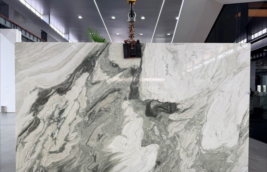
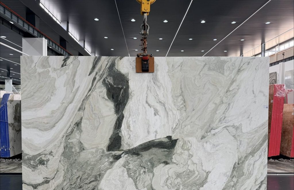
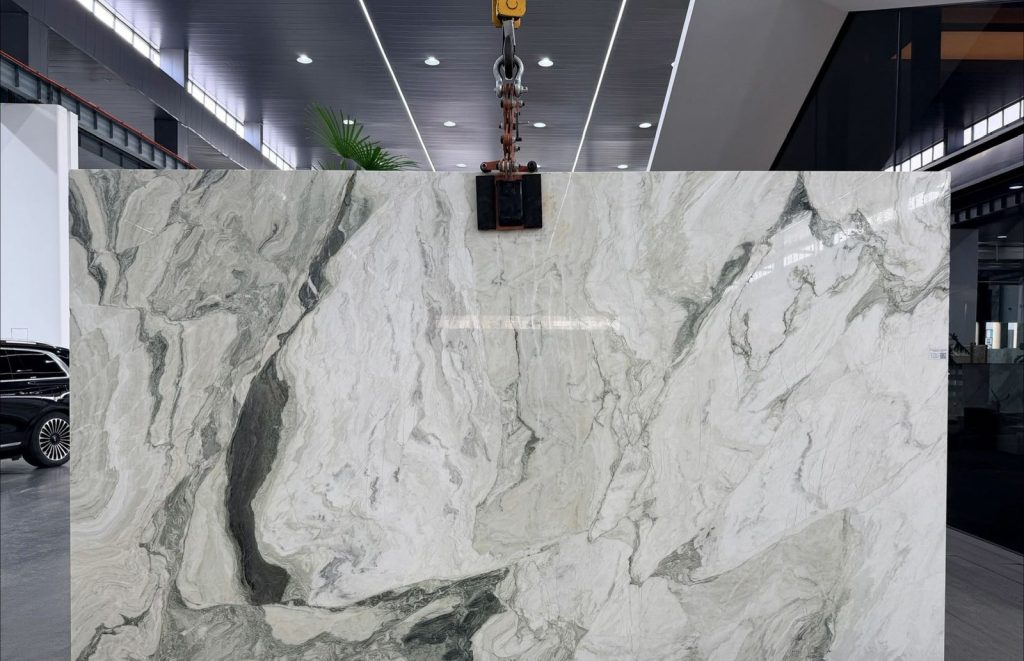
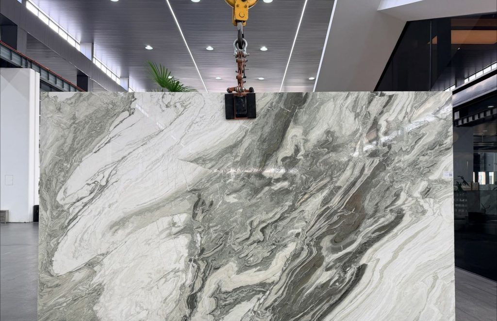
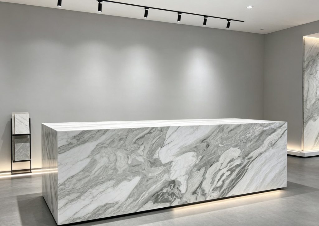
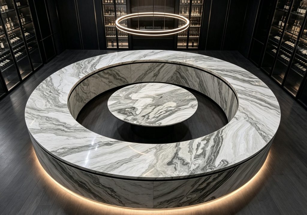
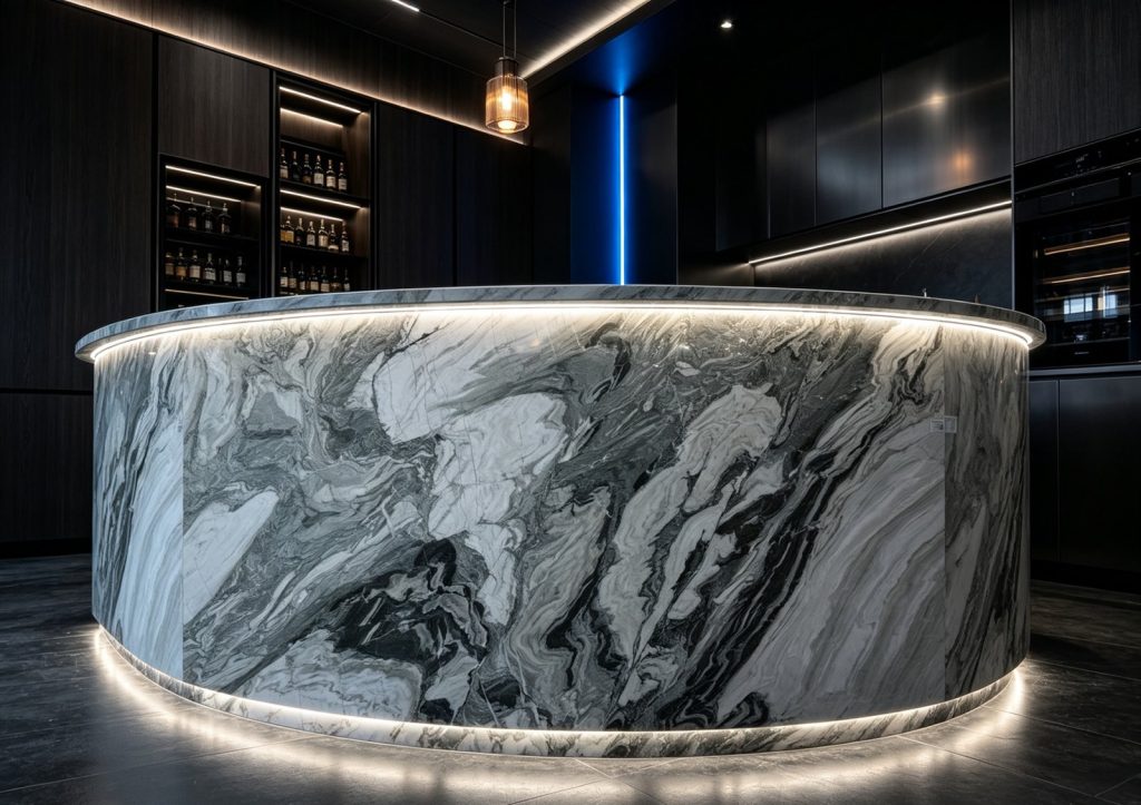
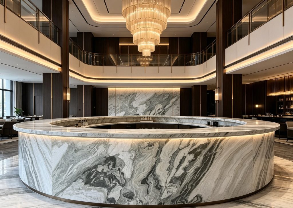
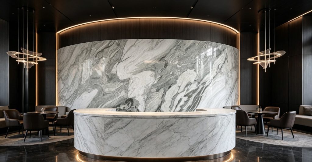
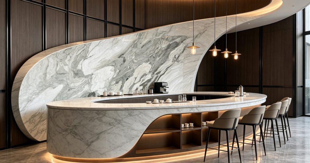
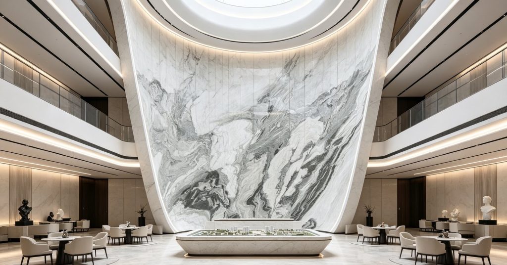
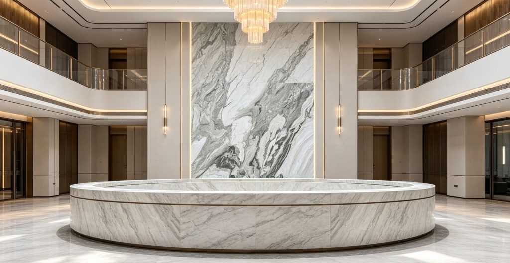
A dark ground shot through with gold, used for kitchens, wall linings and vanities.
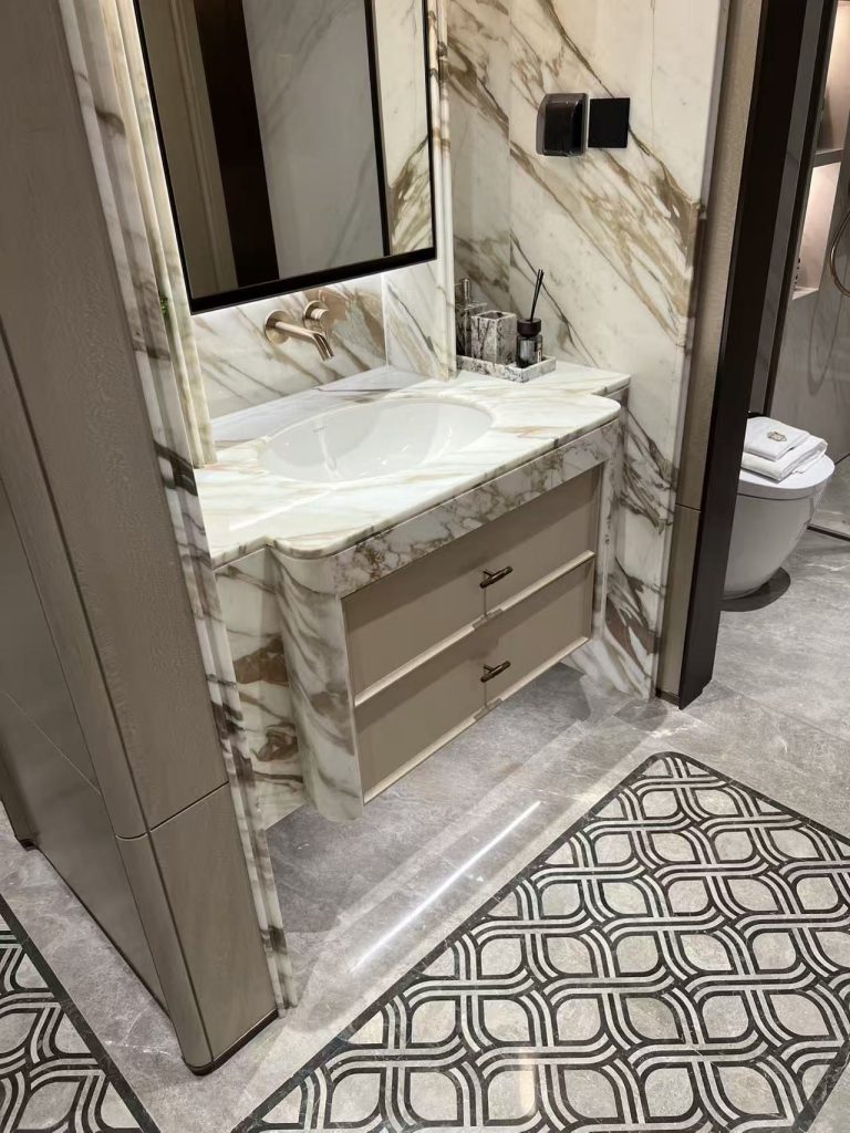
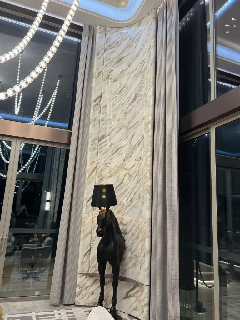
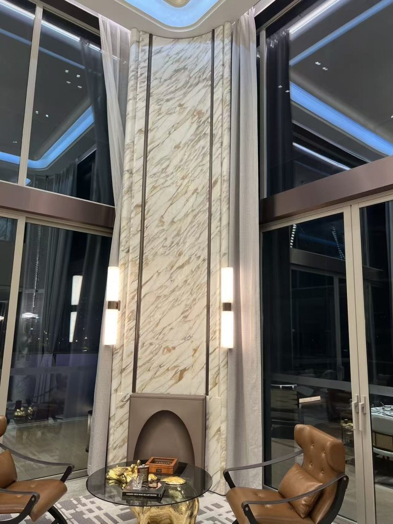
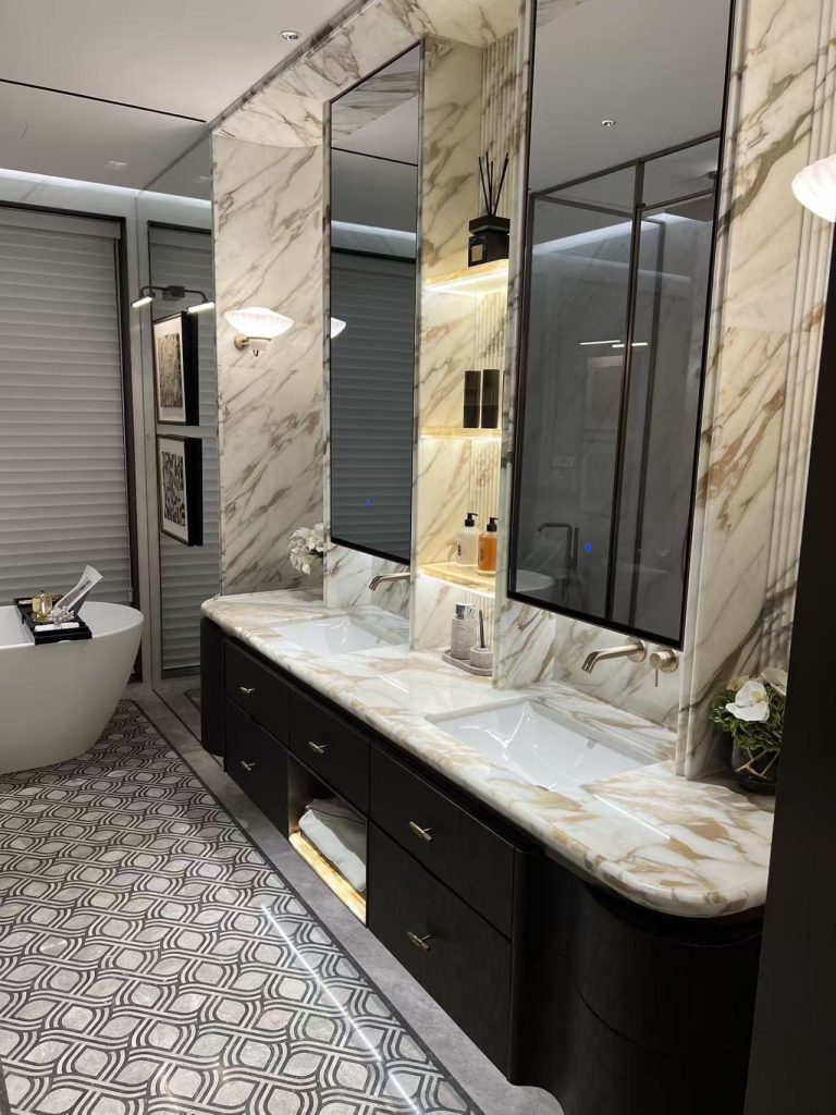
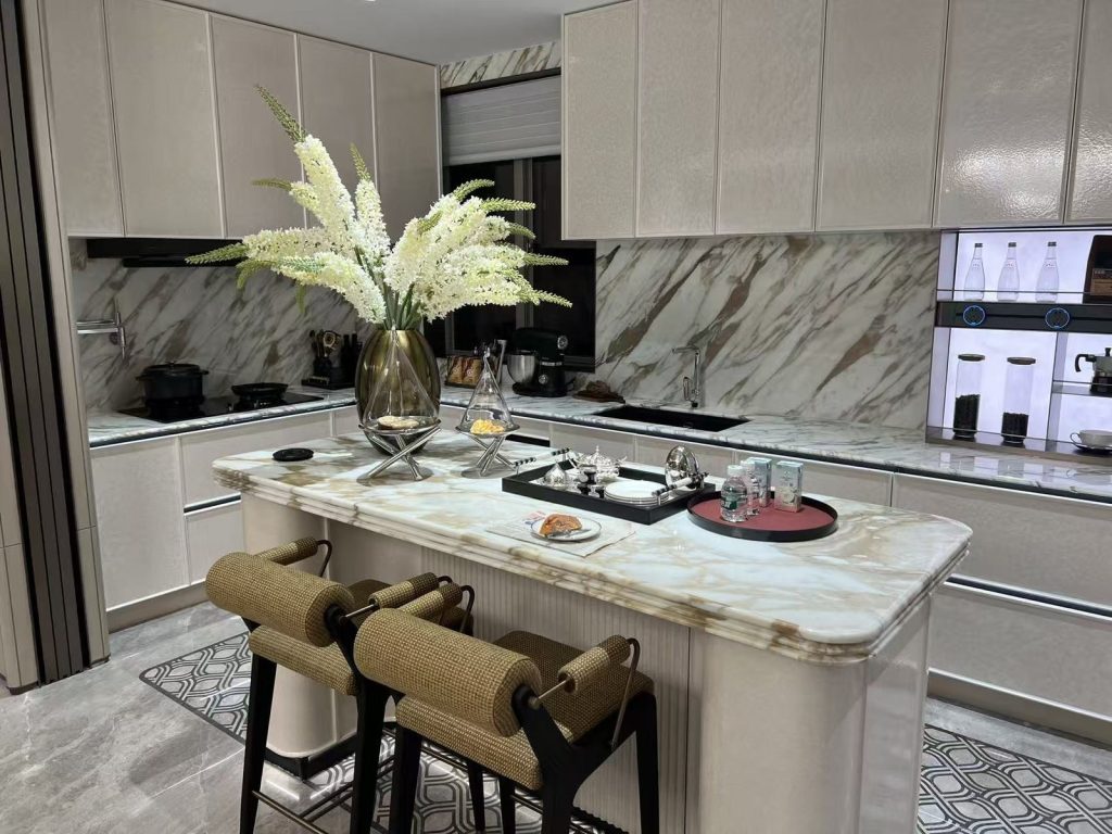
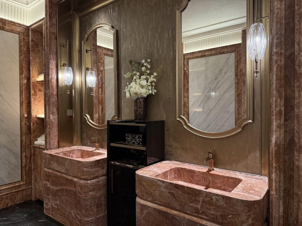
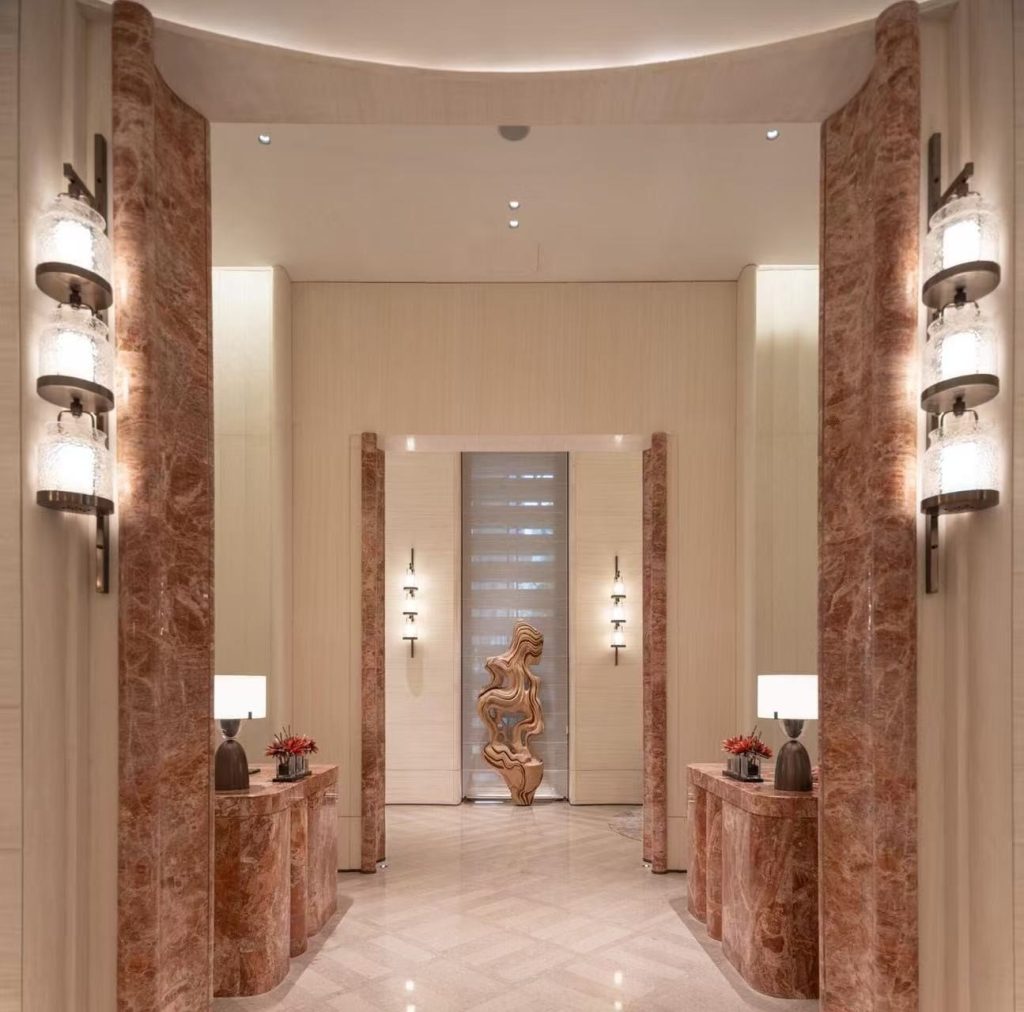
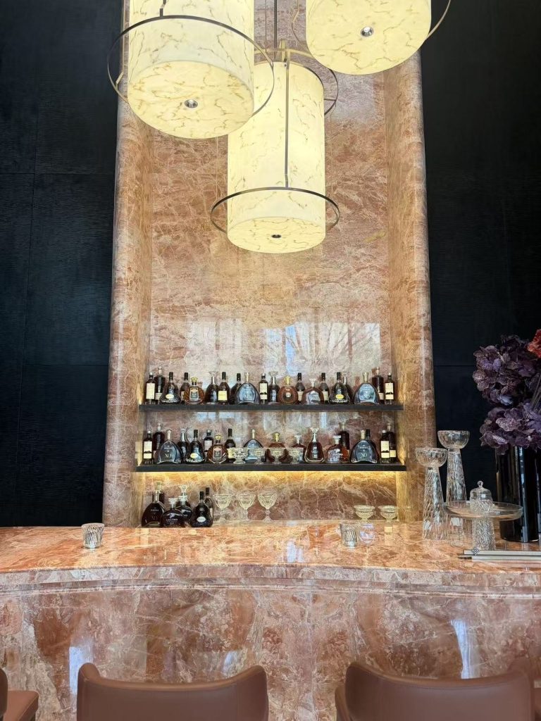
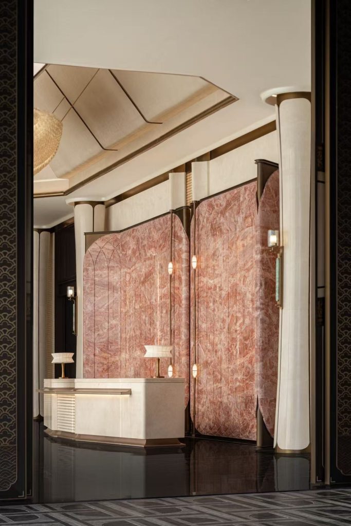
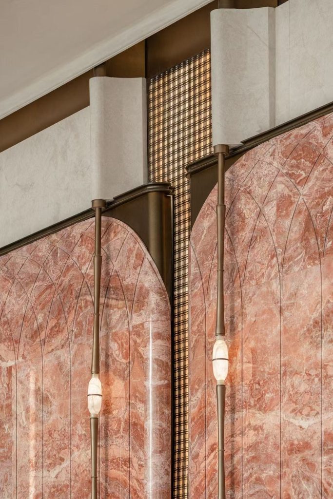
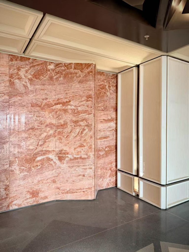
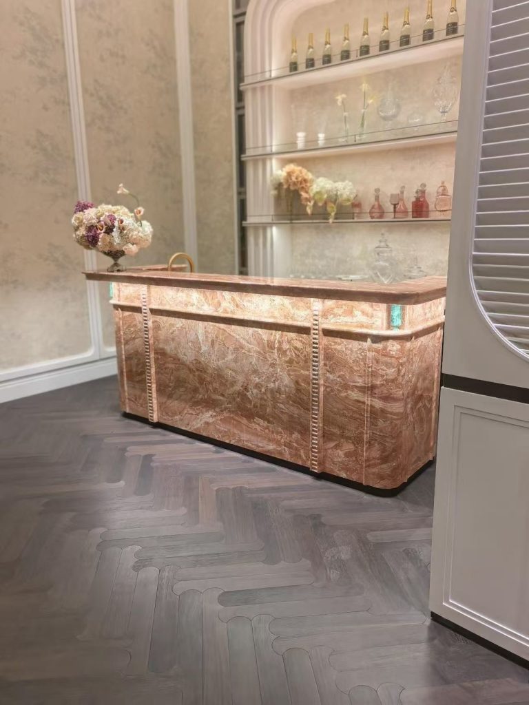
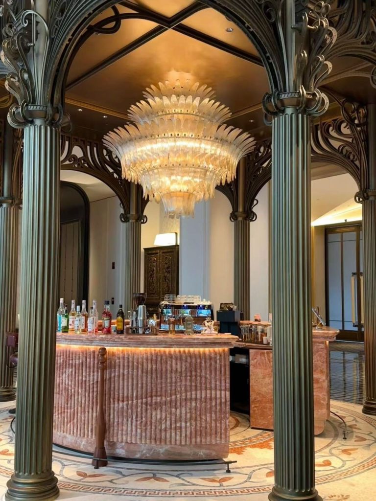
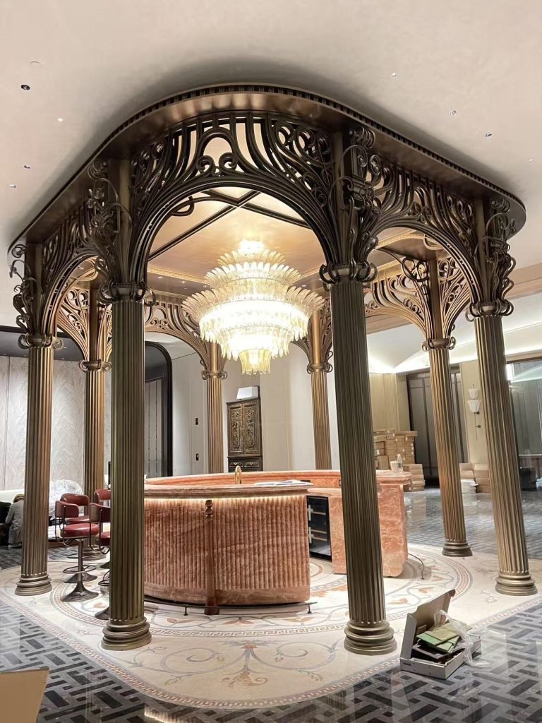
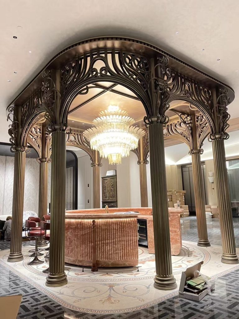
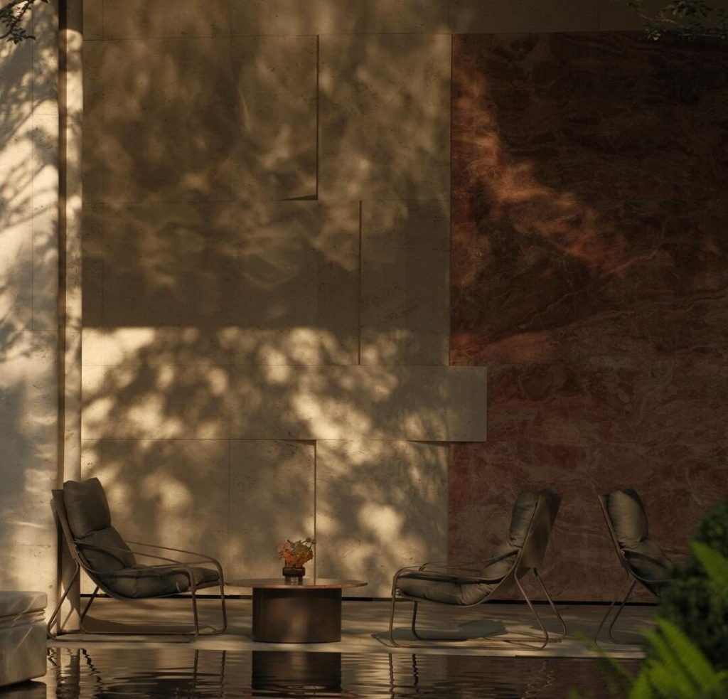
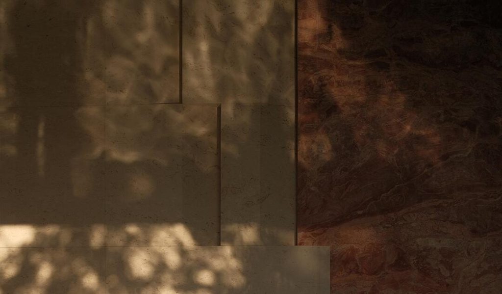
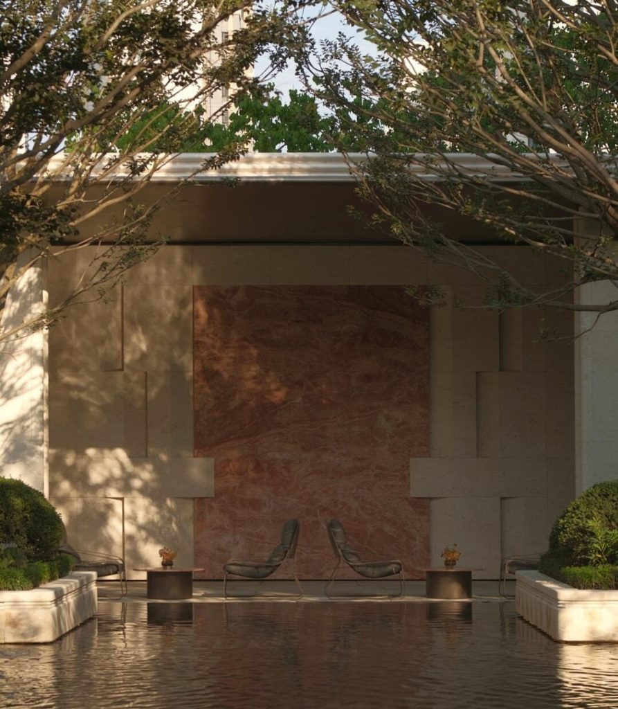
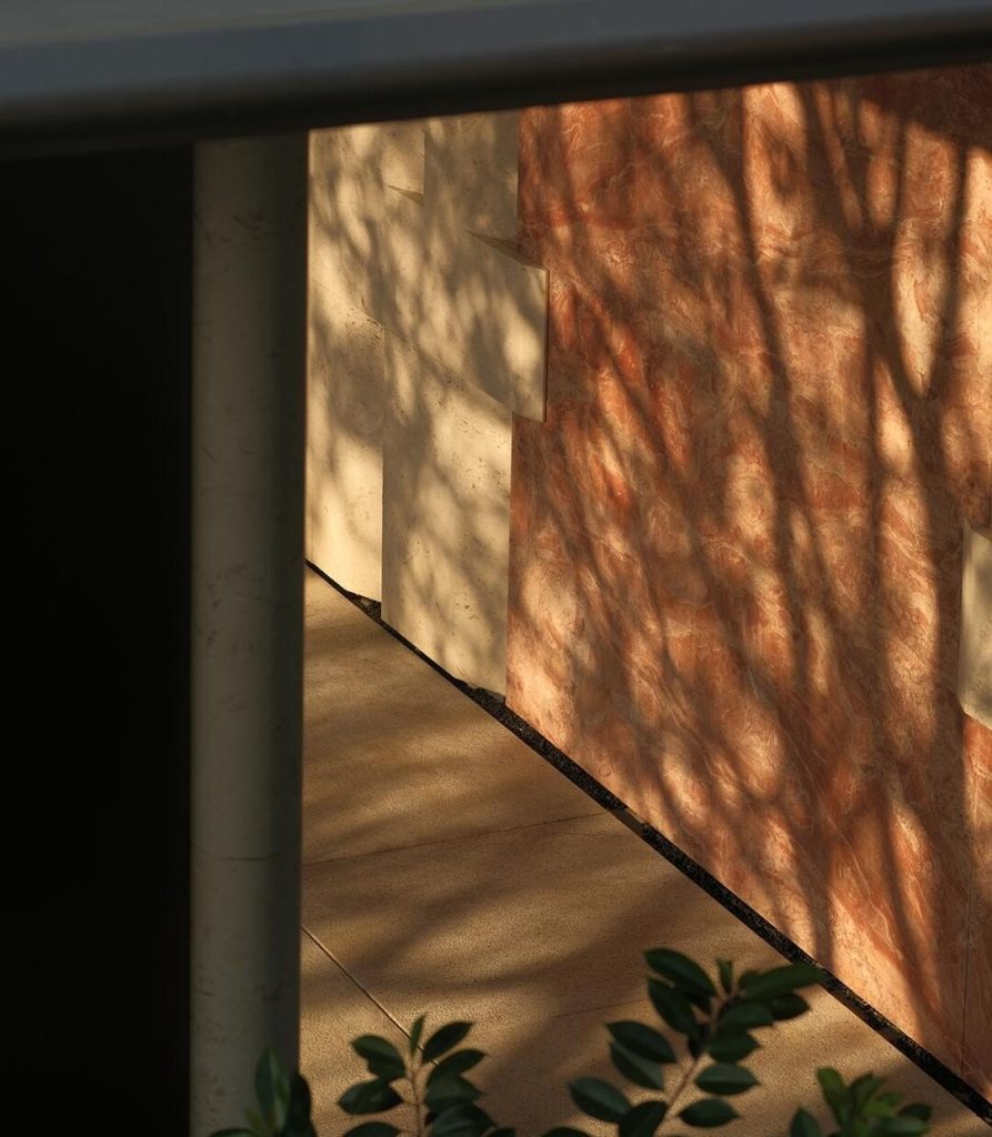
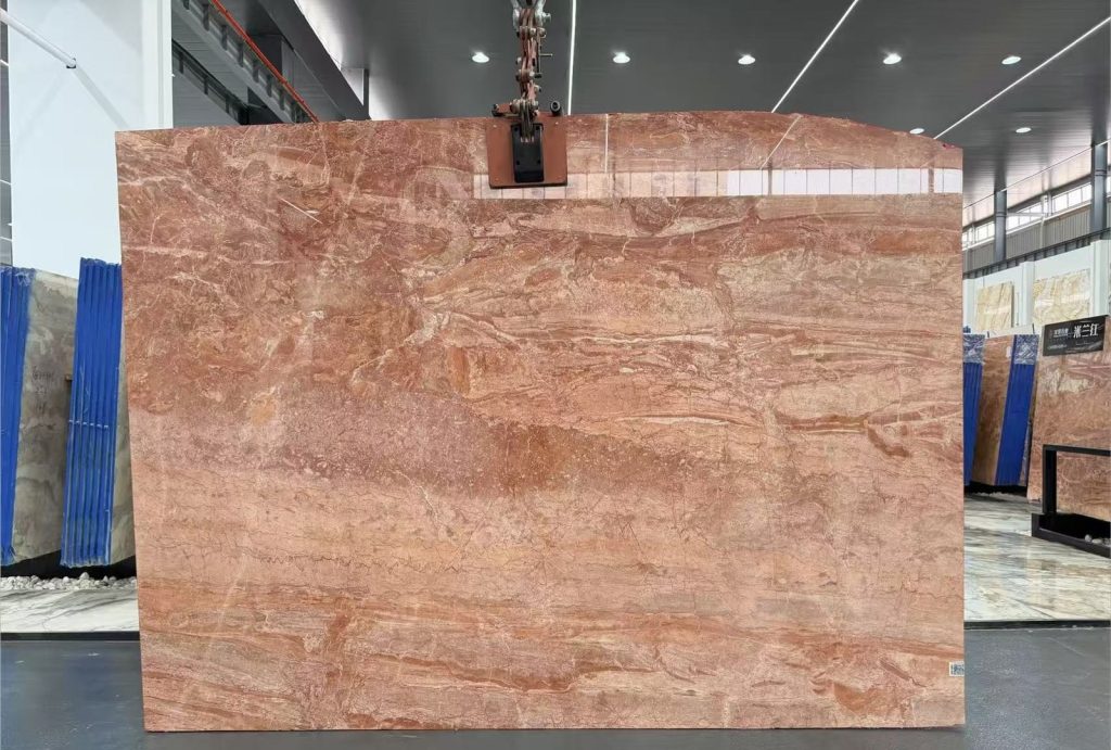
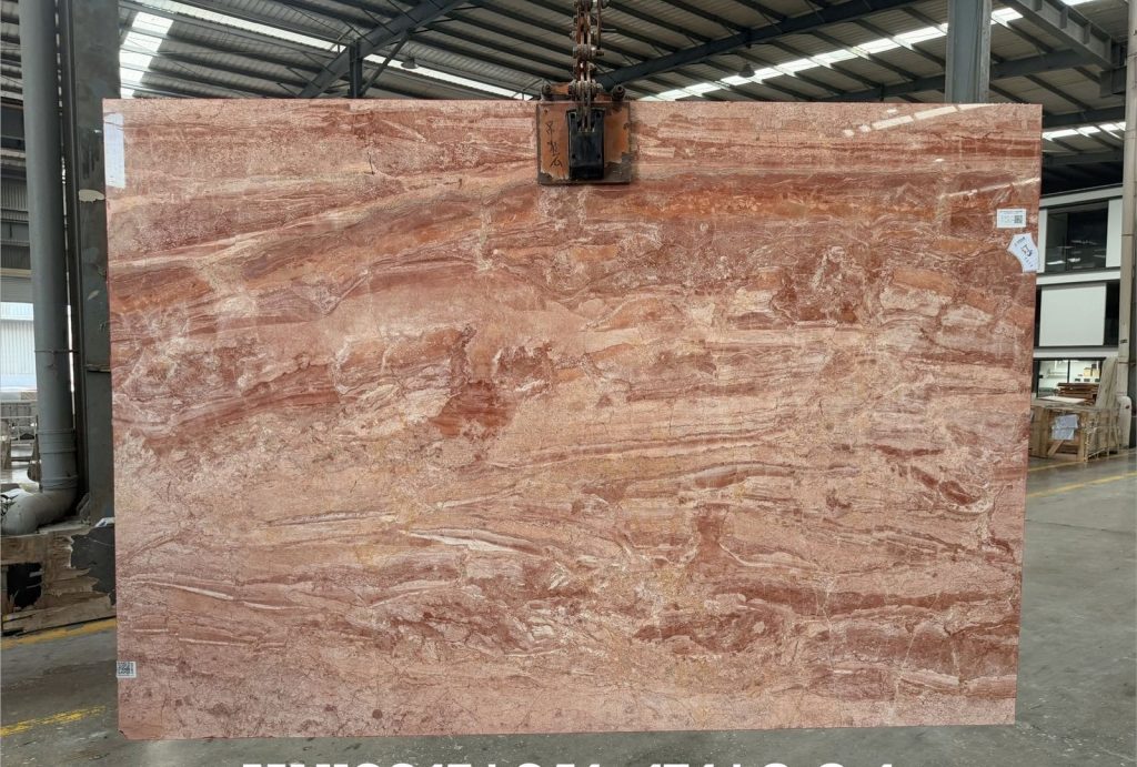
A warm red marble with strong movement, for wall linings, counters and water features.



What a photograph can settle, and what it cannot
A finish sample settles colour and grain. It cannot settle what happens when the block is opened, book-matched and lit from below — the point where a stone either holds a large face together or falls apart into a patchwork. Every image on this page comes from the same material the sample was cut from, photographed in the room it was set in, with no filter and no fill light.
Read the wall, not the stone
The useful information in these photographs sits at the edges: how a vein runs out at a corner, whether the pattern survives a change of plane, and how much the surface shifts when the light moves from above to the side. A stone that reads calm on a horizontal sample can turn busy on a vertical face several floors up, because the distance you read it from has changed.
“Book-matched” is the part people underestimate. Matching two leaves mirrors the veining into a shape that exists in neither leaf on its own, and that shape is decided before a single piece is cut. Once the layout is fixed, changing it later means cutting new material.
Light changes the answer
Warm interior light pulls the grey in a white marble towards red; daylight through glazing pulls the same stone towards blue. Both readings are honest, a few hours apart. That is why these are shot on site instead of in the workshop, and why a colour decision taken from a catalogue page is worth re-checking against a real room before it becomes an order.
If the surface matters more than the colour, the finish is where to start — polished and honed behave as different materials even when the stone behind them is identical.
What the frame leaves out
Hand feel does not survive a photograph. Joints disappear at thumbnail size. Edge profiles, thickness and the way a corner was resolved all fall outside the frame. If any of those decide your project, ask for the detail drawing rather than another picture.
The four stones in this set
Calacatta Gold carries a white ground under heavy gold veining. It is the most assertive stone here, and the one that pays most for book-matching. Qingchuan White is quieter and takes a curve, which is why it turns up on reception fronts and atrium walls. Bvlgari Gold runs dark with gold through it, and holds its ground in kitchens and wall linings where a pale stone would wash out. Milano Red is warm and strongly moved, used on wall faces, counters and water features.
If your project resembles one of these
Samples of all four travel at cost, cut from the block that would ship rather than from a library piece, so what arrives is what you would receive. Send a drawing, a photograph of the space, or both, and we will say which of the four survives it — and which does not.
Send the drawing. We do the rest.
Reply within one working day, in English or Chinese. Send a spec, a drawing or just a photo of the sample you are matching — we will tell you honestly whether we can hold it.
MOQ 1 × 20FT · FOB XIAMEN · SAMPLES IN 7 DAYS