Why the same stone looks different in the same room
Stone colour is a relationship between mineral, finish and light. What a polished face returns, why wet stone darkens, and what a sample cannot show.
6 November 2026 · 14 min read · GranTerra Stone, Hui'an
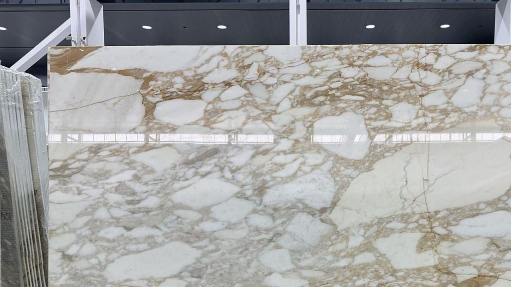
A sample is approved at eleven in the morning in a showroom with a glass front, and the same stone is inspected at nine at night in a lobby lit by recessed lamps. Nothing has been substituted, nothing has been damaged, and the two do not match. Somebody then says the stone changed colour, which is the one thing stone does not do.
What changed is the light. That sounds like an excuse until you take it apart, because the light is not a constant that the material sits under — it is half of what the eye receives. This note is about that half: what a surface does with light, why two finishes of the same block read as two materials, and which of those effects can be written down before the order is placed.
Colour happens between the stone and the light
In a dark room a granite has no colour at all. What it has is a surface that absorbs some wavelengths and returns others, and the colour you see is the product of that surface and whatever spectrum is falling on it at the time. Change the spectrum and the product changes. The stone has not moved.
Daylight is broad and continuous. A lamp is not. It is built from a source and a coating, and its output has peaks and gaps that the eye is very good at ignoring and the material is not. Two stones that sit happily side by side under an overcast sky can separate under a warm interior lamp, because one of them depends on a part of the spectrum the lamp barely produces.
The practical consequence is that a photograph of a slab, taken in the yard, and the same slab seen in a lit room are two different products. Both are honest. Neither is the stone. When a client sends a picture and says the delivered material is wrong, the useful first question is not which batch, but what light the picture was taken in and what light the material is now under.
Batch variation is a real subject and it is covered in the note on colour variation in granite. It is also the first thing people blame, and it is not always the answer.
Two finishes, two ways of returning light
A polished face reflects coherently. Light arrives at a consistent angle and leaves at a consistent angle, so the eye receives an image of the room rather than a colour of stone. That is why a polished floor looks darker from one end of a corridor and almost white from the other: what you are seeing is the ceiling.
A honed face scatters. The same light leaves in many directions, the image is destroyed, and the stone’s own colour dominates. The result reads flatter and usually lighter than the polished version of the identical piece, and it holds that reading from every angle.
A flamed or bush-hammered face scatters even harder. At that point the subject of the surface stops being colour and becomes texture and shadow, which is why heavily textured stone looks more uniform than it is.
None of this is a defect, and none of it is a reason to prefer one finish. It does mean that a decision taken on a polished sample and executed in a honed finish is a change of colour as well as a change of surface. The finishes we work in, and where each one belongs, are set out separately in the piece on granite finishes.
The ceiling ends up in the floor
Walk to the far end of a lobby with a polished stone floor and look back along it. You will see the downlights a second time, in a row, in the floor. The reflection is not a fault and it cannot be polished out, because it is what a polished surface is for.
What makes it strong or weak is geometry rather than the stone. A reflection is most visible at a shallow angle, which is exactly the angle you get when you look along a long floor from a standing height. It is weakest looking straight down. So the same floor reads calm to the person standing on it and busy to the person walking toward it, and the person walking toward it is usually the guest.
This is a lighting and layout decision, taken before the stone is ordered. Spacing, lumen output, the angle of the fixture and the choice between polished and honed all belong to somebody else’s drawing. We can say what a given finish will do with a given arrangement, and we can say it early, but we cannot remove a reflection at the saw.
There is one thing worth knowing on the other side. A band of reflected light lying across a polished face photographs exactly like a crack. It also arrives in our inbox more often than any genuine defect, and it carries a signature that settles it in a glance: the line continues past the edge of the piece, and reappears on whatever is behind. The inspection note on telling a flaw from a feature deals with the rest of that argument.
Veining is a light effect before it is a pattern
A vein is visible because it returns light differently from the field around it. Sometimes that is colour, sometimes it is a difference in hardness, sometimes it is a filled fracture whose resin polishes at a slightly different rate. All three of those show up more strongly under one kind of light than another.
Under flat, direct light the contrast comes from colour and the pattern reads at face value. Under a raking light — a wall washer, a window at the end of a corridor, a lamp close to a wall — the contrast comes from relief instead. A vein that polishes a fraction lower than its surroundings throws a fine shadow, and a wall that looked almost uniform at midday can turn strongly figured in the evening.
This is why book-matched walls are approved on site and not from a photograph. The match depends on two panels being seen at the same angle under the same light, and a photograph flattens exactly the variable that decides whether it works. The slab note on reading a granite slab covers how the bundle is laid out; what belongs here is that the reading changes with the viewpoint, and a client standing three metres to the left of the person who approved it is entitled to see something different.
On a textured face the effect is total. A flamed panel’s pattern is mostly shadow, so it softens in diffuse light and sharpens in sun. Interior wall panels in textured stone are usually chosen from a sample seen indoors, which is the one condition where the material looks least like itself. The interior cladding note takes that further.
Wet stone is a darker material, not a dirty one
When water fills the pores at the surface, light stops scattering at the pore walls and enters the material instead. Less of it comes back, and what does come back is more saturated. The stone goes darker and richer, and it does so evenly and immediately. Anyone who has seen a paving slab after rain has seen this without naming it.
Two consequences follow, and both are ordering decisions rather than maintenance ones. The first is that a stone which will be wet for most of the year should be chosen in its wet state. Pool surrounds, shower floors, coastal paving and spa areas spend more of their life dark than light, and a colour chosen from a dry sample in a showroom is a colour that will exist for a few hours a year. The wet edge is covered in the pool coping note.
The second is that a wet patch and a stain are visually identical. A puddle that has not dried, a damp area beside a drain, a spill that has soaked in — all three darken the surface in the same way at first glance. A penetrating sealer slows the rate at which this happens; it does not stop it, and it does not make the stone waterproof. That distinction, and what a sealer can honestly be asked to do, is set out in the care note. What matters here is simpler: a floor cannot be judged for colour while it is drying.
The same face at four distances
Stone is judged from four distances, usually by four different people, and all four of them are right about different things.
At arm’s length you see the grain, the pits, the filled areas and the quality of the polish. This is the distance of the person who is paying for a finish, and it is the only distance at which a repair is visible.
A step back you see the piece: the layout of the vein, the edge, whether the joint line is straight. This is where a single badly oriented panel announces itself.
Across a few metres you see the field: the rhythm of the joints, the repetition of the pattern, whether the numbering did its job. A perfectly good set of pieces can fail here, because the failure is in the arrangement rather than in any one piece. Paving layout is where this shows first, and the note on paving patterns deals with the geometry.
From the far side of the room you see average colour and nothing else. This is the distance of the person who walks in and says it looks patchy, and they are usually describing a judgement made at three metres about a decision taken at one.
Most colour disputes are a conversation between two of these distances without anybody saying which one they are standing at. It is worth stating it, in writing, when a sample is approved: this is the distance at which this surface will be judged.
A lobby has a day shift and a night shift
In hospitality the stone works two jobs. By day the room is lit by whatever daylight reaches it, often cool and often indirect, and the people in it are staff preparing the space. After dark the room is lit by lamps chosen for atmosphere, and that is when it earns its money.
The two conditions produce two different materials. Daylight shows the stone’s own colour with a cool bias and reveals texture. Warm interior light shifts the whole surface toward the lamp, kills the cool notes, and adds reflection from every polished face. A floor that reads grey and quiet at ten in the morning can read warm and glossy at eight in the evening, and neither reading is wrong.
The useful discipline is to approve in the condition that matters. A hotel lobby, a restaurant floor, a bar front and a reception desk are all judged after dark by the people who paid for them. Approving them in a daylit showroom is approving the version of the material that fewest people will see.
This is the same argument as the one about sample panels and mock-ups, approached from the other end. A panel is worth building because it can be looked at twice; the second look has to happen under the light the space will actually use, or the panel has only answered half the question.
Narrow-spectrum lamps do not show the whole stone
Most of the lamps now specified in commercial interiors are not continuous sources. They produce a strong band and fill in the rest with a phosphor, and the result has gaps. The eye adapts to this within seconds and stops noticing. A mineral in the stone does not adapt.
The practical version of that is a grey stone that drifts green under one fitting and looks neutral under the next, or a warm stone that goes flat under a lamp with no output in the red end. Neither is a colour fault, and neither can be diagnosed from a swatch. Warmth and accuracy are different properties, and a lamp can be warm and still show a poor rendition of the surface in front of it.
Two habits keep this manageable. The first is to look at the sample under the actual fixture, or one of the same family, rather than under the showroom’s ceiling. The second is to notice how much a stone depends on a single mineral for its colour. A mid-grey, evenly grained granite has its colour spread across many grains and survives almost any lamp. A stone whose character comes from one striking component has more to lose, and it will change more between rooms. The comparison between granite, quartz and marble in choosing a worktop material runs through the same logic from the point of view of use rather than light.
Where our part ends and the lighting design begins
It is worth being exact about the boundary, because most of the arguments in this area happen where nobody has drawn it.
We control the material, the block, the batch, and whether the pieces in one delivery come from that batch. We control the finish and its consistency across an order, the flatness of a face, the straightness of an edge, and the joint width we cut to. We disclose filled areas. We hold a reference sample. Each of those can be checked at the bench by anyone who asks, and each is a fair basis for complaint if it fails.
We do not control the lamp, its position, its angle, its spacing or its spectrum. We do not control whether the room has daylight, whether the floor was specified polished, or what the client remembers from a showroom they visited once. When a surface reads wrong, the cause is sometimes in our half and sometimes in the other, and the useful move is to identify which before anybody defends anything.
Our written position is narrower than a promise and more useful than one. This is the finish and what it does with light. This is the batch, and this is the range you should expect within it. This is the reference sample, and these are the conditions under which it was approved. Given a lamp and an angle, this is how the surface will read. That last sentence is the one that prevents a disagreement, and it can only be written if somebody asks the question before the order.
Three things to send with the drawing
A drawing settles the geometry. It does not settle how the finished surface will look in the room, and that is usually the thing the client actually cares about. Three sentences close most of the gap.
What the space is for, and when it earns its money. A restaurant floor and a service corridor want different answers even when they share a material.
What the light will be. Daylight, or lamps, or both, and if the fittings are already chosen, what they are. If that is not decided yet, say so, because a finish can be chosen to be forgiving of a decision that has not been made.
Whether the stone will be mostly wet or mostly dry, and whether it will be judged up close or from across the room. Those two answers decide more about the choice than any photograph.
With those in hand, the reply can name a finish that will behave under the conditions rather than a finish that looked good in a showroom, and it can flag the one expectation in the brief that the room will not support. That is a more useful conversation than a colour match, and it is much cheaper than discovering the problem at nine at night in a finished lobby. Send what you have through the enquiry form, even if the light fittings are still a sketch.
Every figure on this page comes from our own order sheets. Where something is a trade norm rather than a number we can hold, we say so — send a spec and we will confirm it against a real block before you commit.
More from the yard
Send the drawing. We do the rest.
Reply within one working day, in English or Chinese. Send a spec, a drawing or just a photo of the sample you are matching — we will tell you honestly whether we can hold it.
MOQ 1 × 20FT · FOB XIAMEN · SAMPLES IN 7 DAYS